Graffiti Letter Y
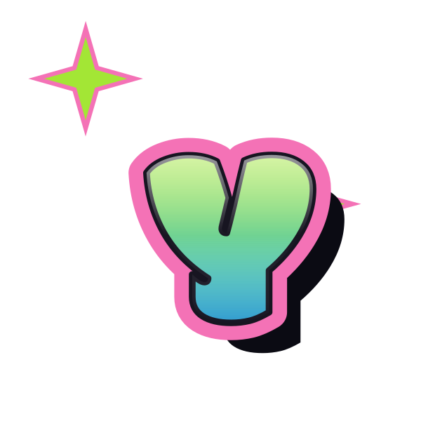
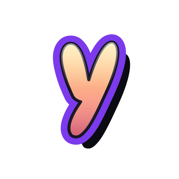
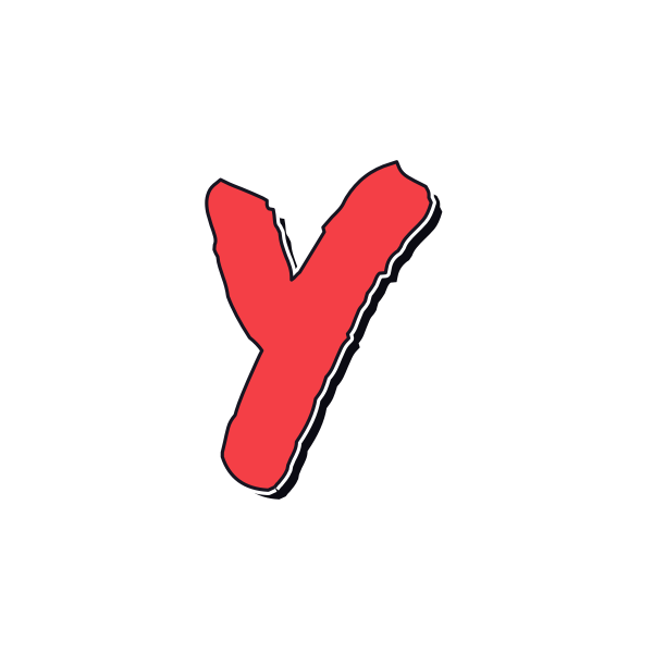
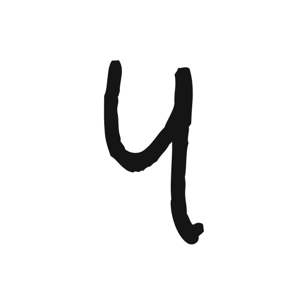
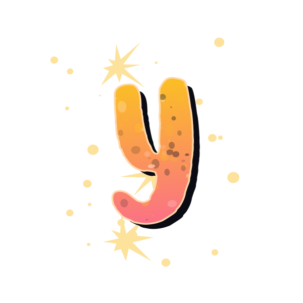
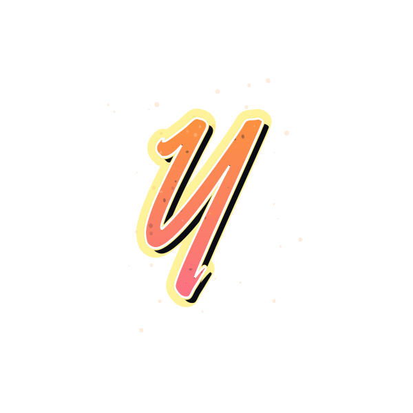
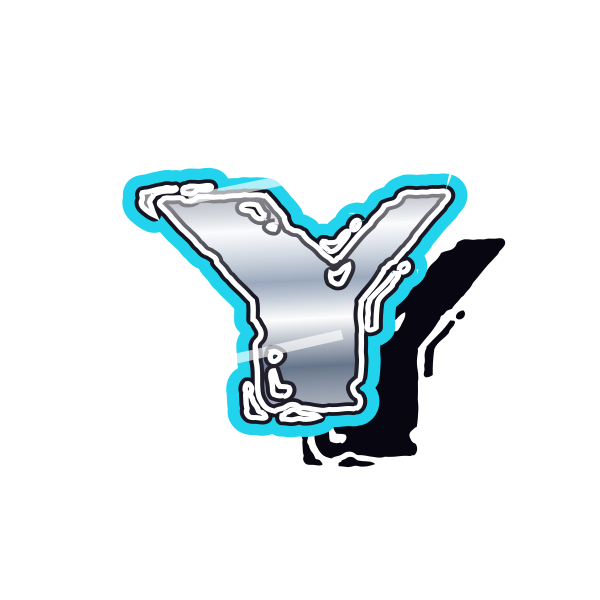
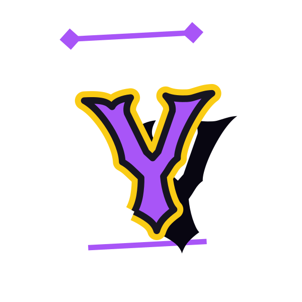
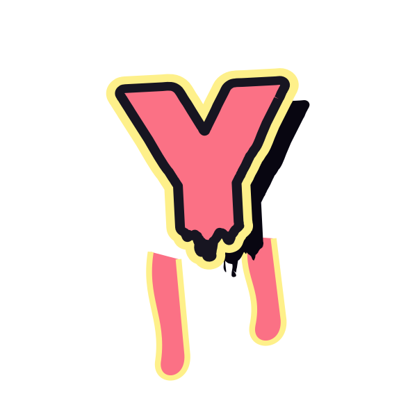
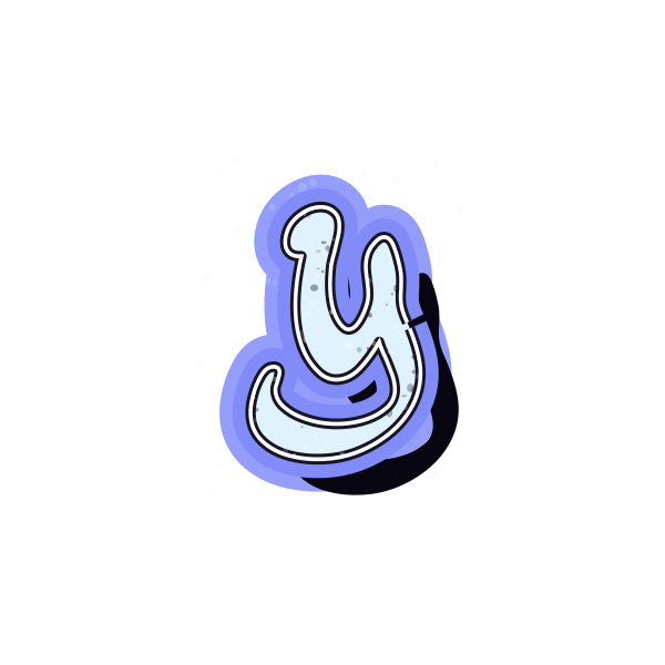
Graffiti letter Y divides into two upper arms before narrowing into a stem. The fork gives it an open, lifted appearance that changes with rounded volume or sharper strokes.








How to use graffiti letter Y
- 1
Look at the fork
Choose a Y with enough separation between its upper arms.
- 2
Select a finish
Save a straight or sweeping stem according to the mood you want.
- 3
Place the branching form
Open Y on the canvas and allow space above both arms.
- 4
Try your lettering
Enter a name and see how its first or last Y balances the line.
Ideas for your graffiti letter Y
Portrait initial accent
The upper fork can sit beside a portrait with space around both tips.
Youth project cover
Choose a clear, lively Y for a personal project title graphic.
Journal front page
A tall stem provides a simple initial decoration on a narrow page.
Personal name ending
A sweeping lower stroke can give a name ending in Y a distinctive finish.
Paired initials graphic
Use the open upper shape beside a compact second initial.
Celebration label
A rounded Y can personalize a small event or gift layout.
Graffiti letter Y FAQs
What distinguishes Y from V?
The stem below the fork is essential. Keep it visible rather than letting a crop remove the lower part.
Can Y feel too tall beside other capitals?
A long stem may give that impression. Compare overall scale and baseline when arranging a pair or name.
Which Y looks softer?
Rounded arm ends and a smooth central join soften the fork without hiding its branching structure.
How can I keep the top of Y clear on a busy background?
Choose strong edge contrast and leave the gap between the arms over a quieter area of the composition.
Can I shorten the visual finish by choosing another style?
Yes. Compare the compact previews with flowing tag treatments before opening the one that suits your layout.