Graffiti Letter X
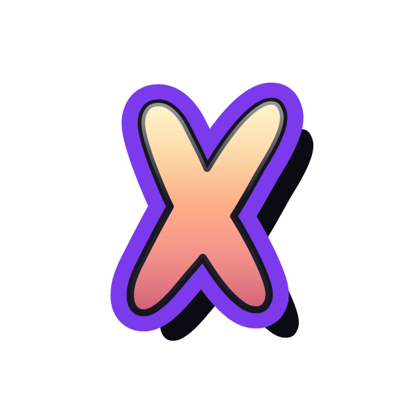
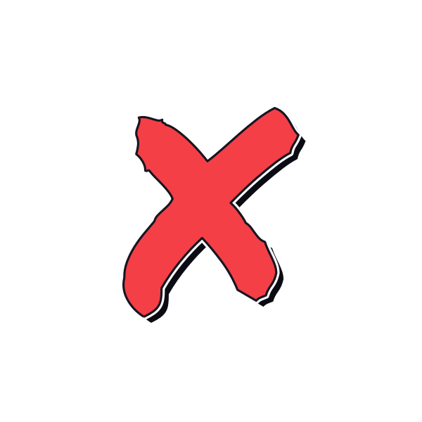
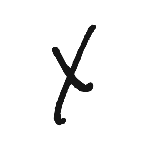
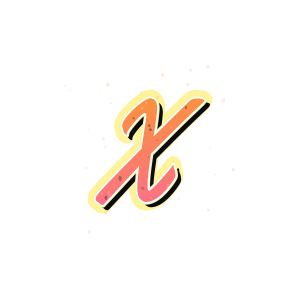
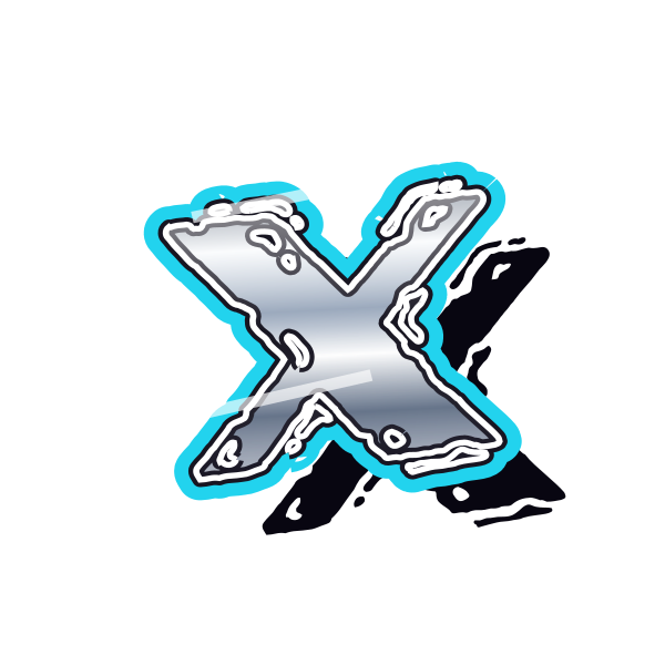
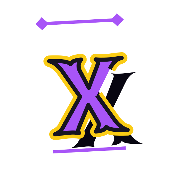
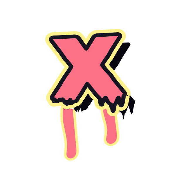
Graffiti letter X creates a strong center where two diagonals cross. Its four outward ends can feel balanced and compact or stretched into a more dramatic design.











How to use graffiti letter X
- 1
Examine the crossing
Pick an X with a central join that does not become a heavy unreadable patch.
- 2
Choose the reach
Save short arms for a compact mark or longer ends for a bigger composition.
- 3
Set its position
Open X in the editor and keep all four ends within the canvas.
- 4
Try it with text
Enter a word or pair of initials to give the standalone shape context.
Ideas for your graffiti letter X
Experimental cover
A bold X can act as the central initial in a personal cover study.
Graphic divider
Place X between two visual elements when it also fits your intended meaning.
Personal badge accent
Compact crossed strokes can make a clear initial inside a small frame.
Sketchbook marker
Use an expressive X to distinguish a personal art notebook.
Name ending
Compare how the outward strokes finish a name that ends in X.
Poster focal point
Leave clear space around a large X so it does not compete with nearby graphics.
Graffiti letter X FAQs
Can X be mistaken for a symbol rather than a letter?
Yes. Add a name or other lettering if its alphabetic meaning needs to be obvious.
What makes the center of X look too dark?
Overlapping outlines and shadows can concentrate there. A simpler preset or lighter effects may keep the crossing clearer.
Does X need perfectly equal arms?
Equal arms feel balanced; uneven lengths can add movement. Choose according to the surrounding composition.
Which X works best at small size?
A clear crossing and distinct ends are more useful than tiny interior textures that disappear when reduced.
How do I place X over another image?
Use a transparent-background version and keep the crossing away from busy details in the image below it.