Graffiti Letter O
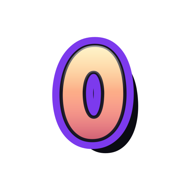
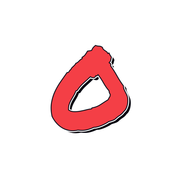
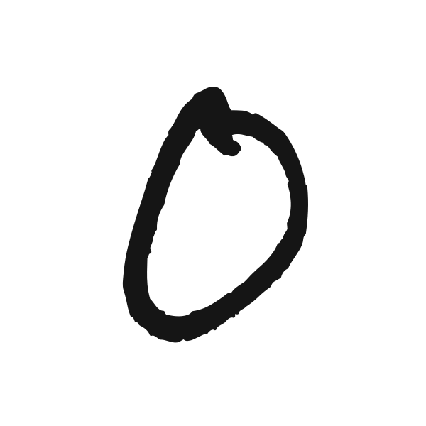
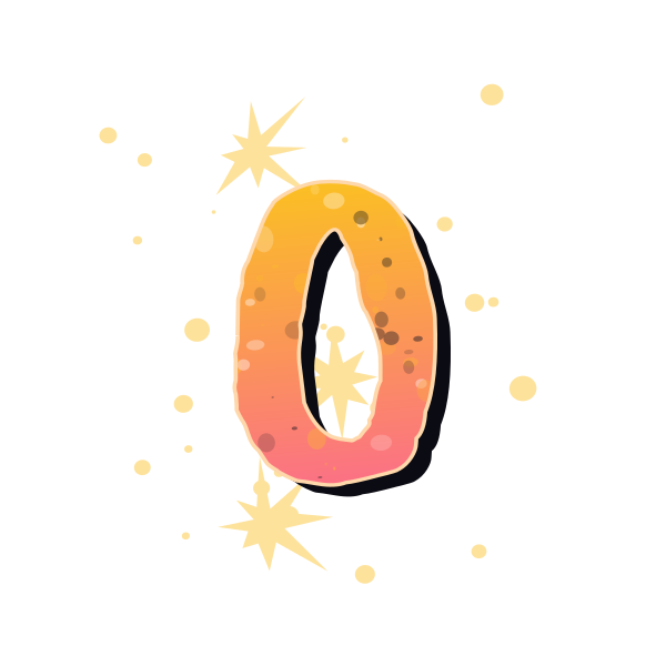
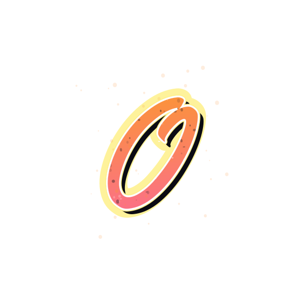
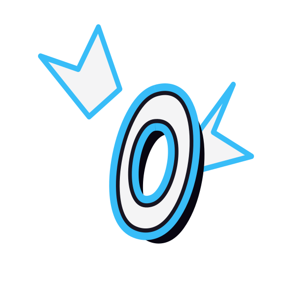
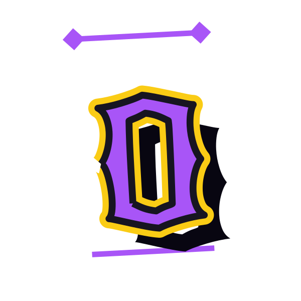
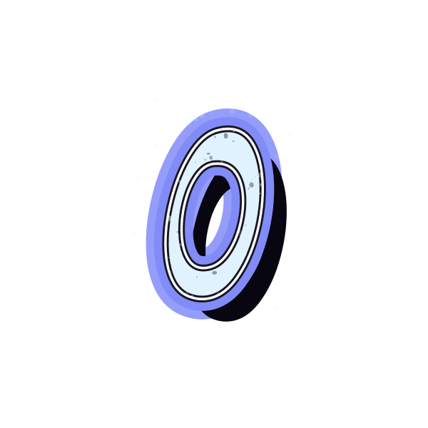
Graffiti letter O turns a simple loop into a broad range of looks. Compare the size of the center, the weight of the outline and the finish around its curved body.










How to use graffiti letter O
- 1
Choose the inner space
Start with an O whose center is as open or compact as your layout needs.
- 2
Save the right weight
Select a lighter ring or a fuller shape from the preview actions.
- 3
Frame the letter
Open O in the editor and keep the surrounding margins balanced.
- 4
Try a short word
Enter your text to see how the round form sits beside straight strokes.
Ideas for your graffiti letter O
Round profile mark
The looping silhouette can sit naturally inside a circular avatar crop.
Cover ring accent
Use O as a large initial around a quiet area of a cover design.
Personal badge
A clear inner opening helps a small O remain recognizable.
Photo collage detail
Layer a background-free loop beside an image without covering the main subject.
Notebook decoration
Choose a textured ring to mark a personal journal cover.
Initial contrast
Pair O with a narrow letter for a simple curved-versus-straight arrangement.
Graffiti letter O FAQs
How do I keep O from looking like zero?
Context matters because their shapes can overlap. Pair it with a name or other letters when the distinction is important.
Is a smaller center better for bubble O?
It makes the letter feel fuller, but an overly tight opening can vanish at small sizes. Compare both proportions.
Can I put text inside O?
Use the loop as a layout element, keeping a clear gap between the inner edge and any added text.
Which O works on a patterned background?
Choose a strong outline with clear contrast so the outer curve does not blend into the pattern.
Can I make a whole word with this rounded look?
Load the preferred O preset in the editor and replace the initial with your wording.