Graffiti Letter I
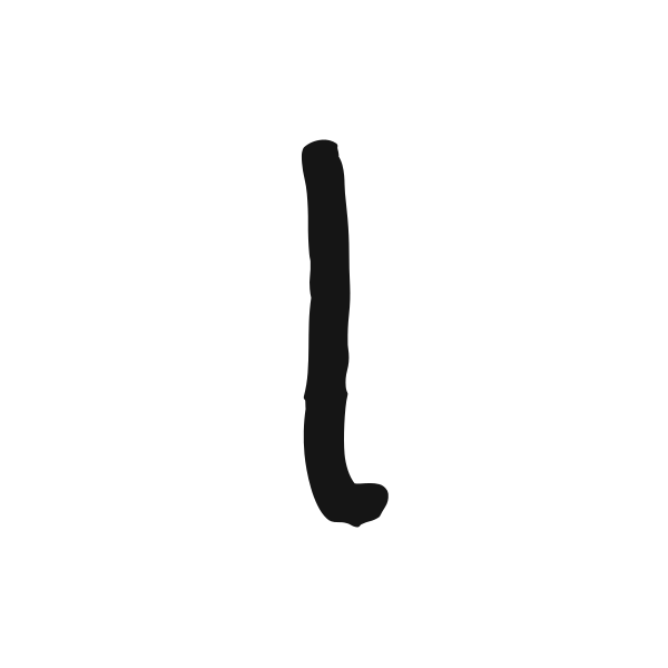
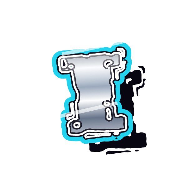
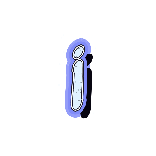
Graffiti letter I occupies less width than most capitals. Caps, outlines and texture can give this slim character presence while keeping its identity clear.















How to use graffiti letter I
- 1
Look beyond width
Compare the top and bottom details that distinguish each I.
- 2
Choose a readable mark
Save an initial that does not disappear when viewed small.
- 3
Give it space
Open I in the editor and use the surrounding canvas to balance its narrow form.
- 4
Check it in context
Type a short name and examine how the slim letter sits between wider characters.
Ideas for your graffiti letter I
Narrow label
A compact I can fit into a vertical strip on a personal label.
Minimal avatar
Use generous blank space to give a single upright a deliberate appearance.
Spine decoration
The narrow silhouette suits the edge of a notebook cover design.
Initial pair
Place I beside a wider character to create a contrasting two-letter layout.
Small cover accent
A capped I can punctuate a title without taking much horizontal room.
Personal monogram study
Compare simple and ornate versions before arranging your initials.
Graffiti letter I FAQs
How do I distinguish I from a lowercase l?
Choose visible top and bottom caps, or use the initial beside other capitals that establish its context.
Should I stretch I to fill a square?
Uniform scaling preserves the intended shape. Extra empty space is often preferable to widening the strokes artificially.
Can a thin I work as a profile image?
Yes, if the outline has enough contrast. Check the design at the small size people will actually see.
Which style gives I more personality?
Caps, marker texture and angular extensions can add variety without needing a wider letter body.
How can I judge I inside my name?
Use the editor to enter the complete name; spacing beside narrow letters is easier to assess in context.