Graffiti Letter N
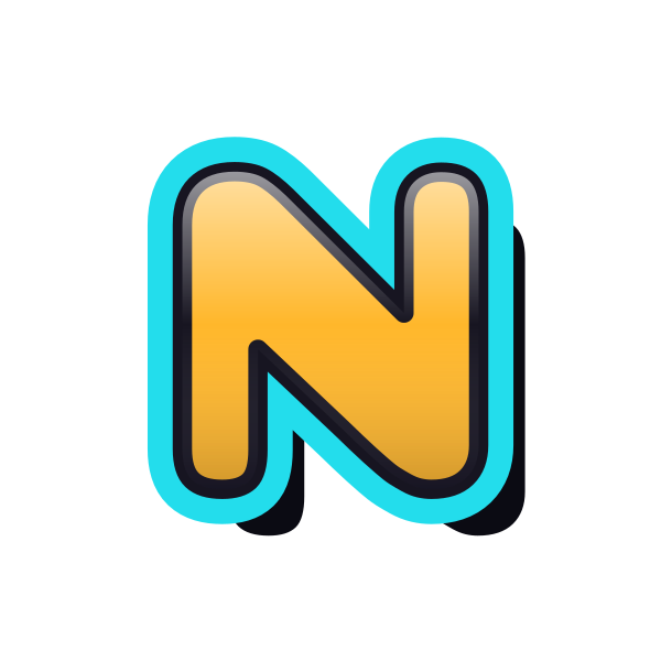
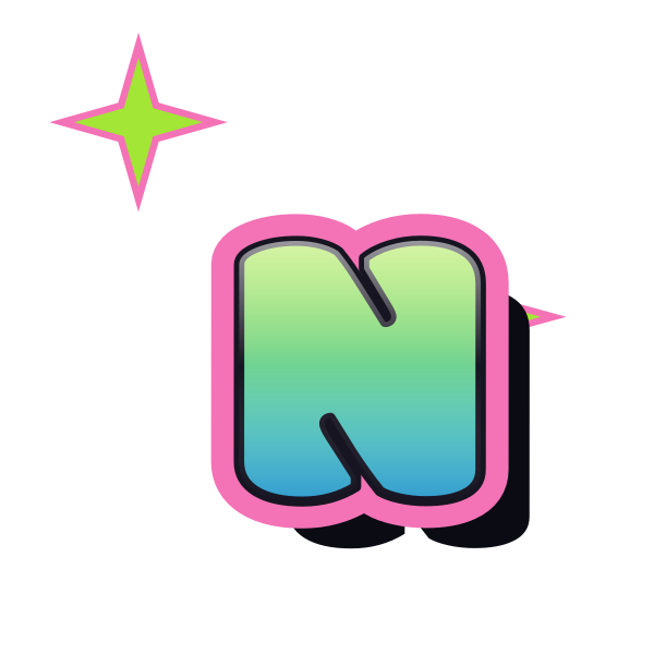
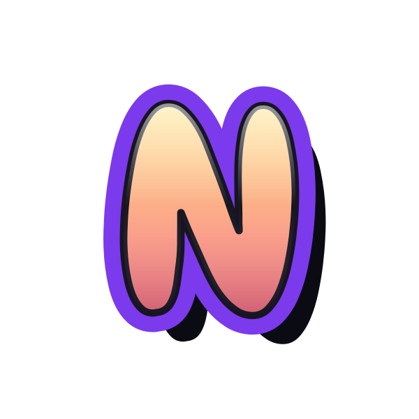
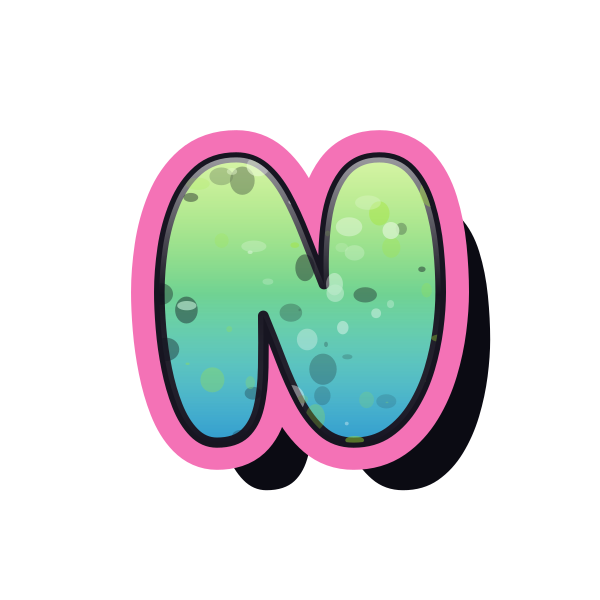
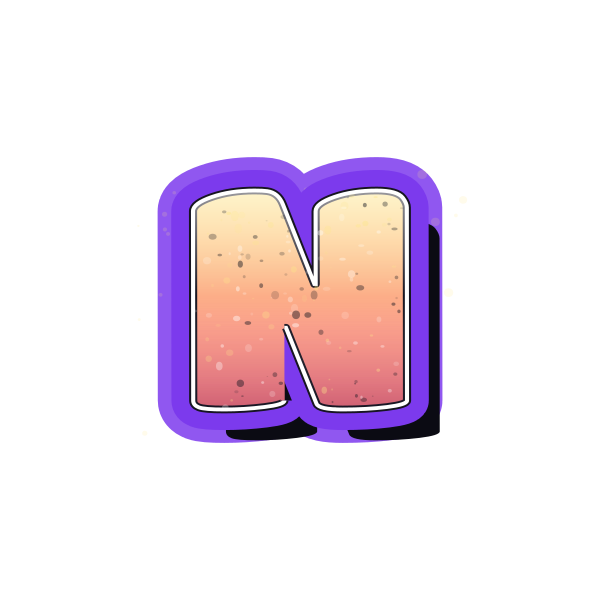
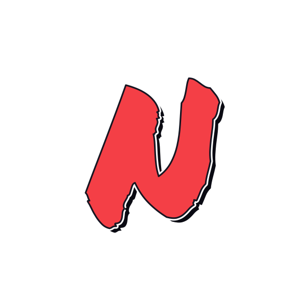
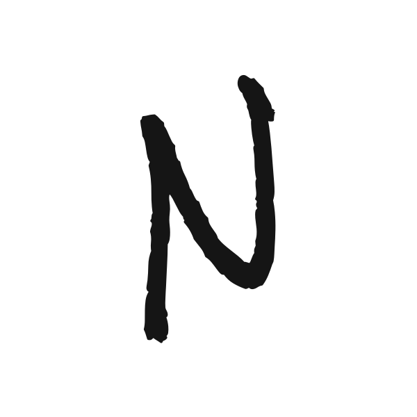
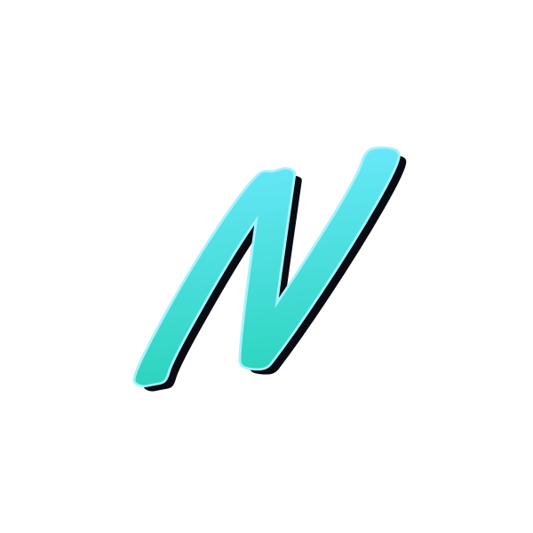
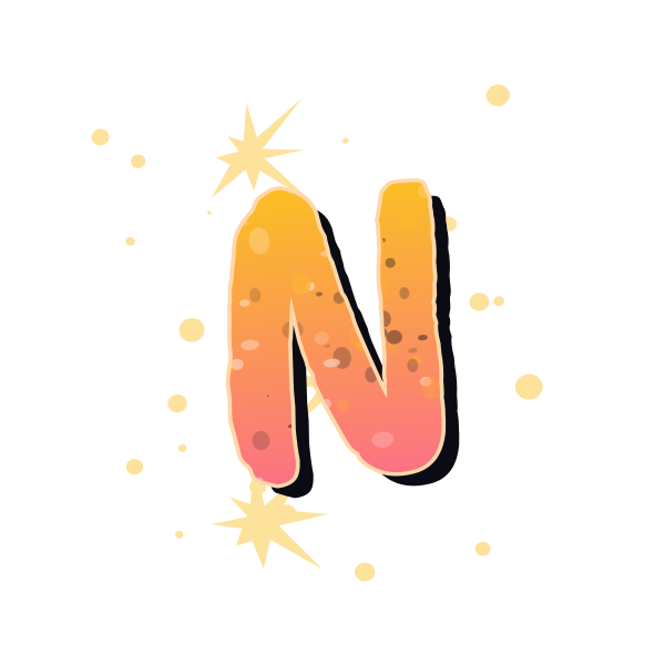
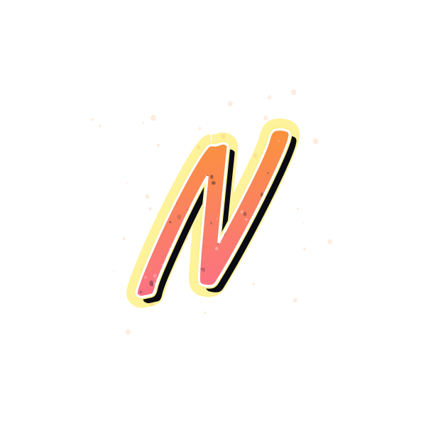
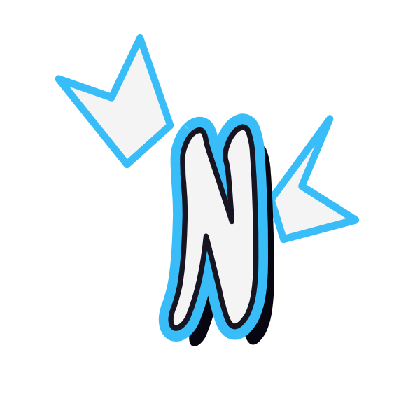
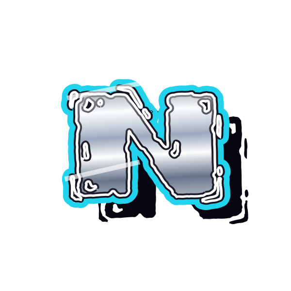
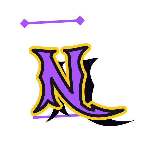
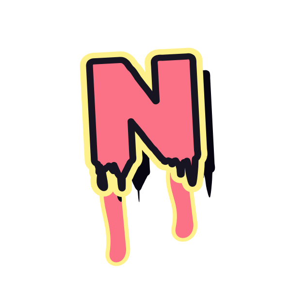
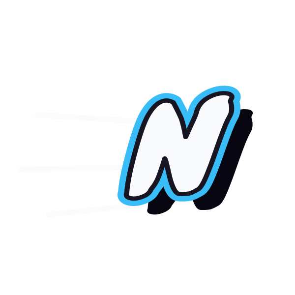
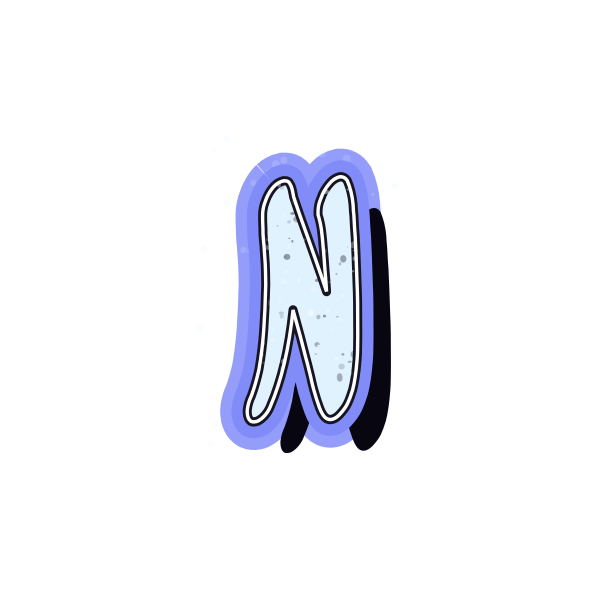
Graffiti letter N connects two uprights with a diagonal. Its moving center can feel brisk and angular or softened by rounded strokes, while the overall form stays compact.


How to use graffiti letter N
- 1
Trace the visual flow
Compare how strongly each design carries the diagonal between the uprights.
- 2
Choose a clean join
Save an N whose connecting stroke remains visible at small size.
- 3
Open the composition
Bring the preset into the editor and give both ends equal room.
- 4
Set your wording
Replace N with a name and examine the rhythm of its diagonals beside other letters.
Ideas for your graffiti letter N
Name badge concept
A compact N can introduce a personal identity graphic.
Night playlist artwork
Try a bright outlined treatment against a darker cover layout.
Notebook tab
A simple N stays useful when reduced to a small section marker.
Diagonal poster accent
Position the initial beside a title to echo its forward movement.
Two-letter arrangement
Combine N with an open curve for contrast in a personal monogram study.
Travel journal cover
Use the initial of a place or name as a cover decoration.
Graffiti letter N FAQs
What keeps N distinct from H?
The diagonal connection is essential. If it looks horizontal under heavy effects, the character can become ambiguous.
Does a slanted N work in an upright layout?
It can provide movement, but compare its angle with nearby text so the contrast feels intentional.
Which N is useful at thumbnail size?
Choose separated upright strokes and a strong diagonal rather than many small internal details.
Can I remove the preview background around N?
Use a transparent-background image so the selected outline can sit directly on your own composition.
How do I compare N with the rest of a word?
Enter the complete text in the preset editor and view it at the scale you intend to use.