Graffiti Letter H
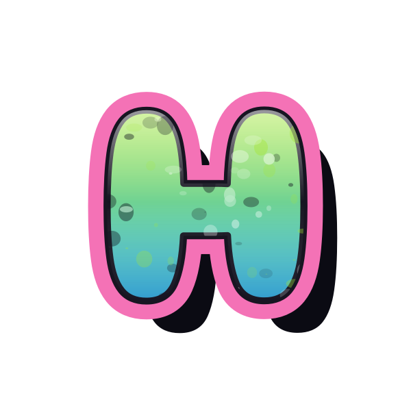
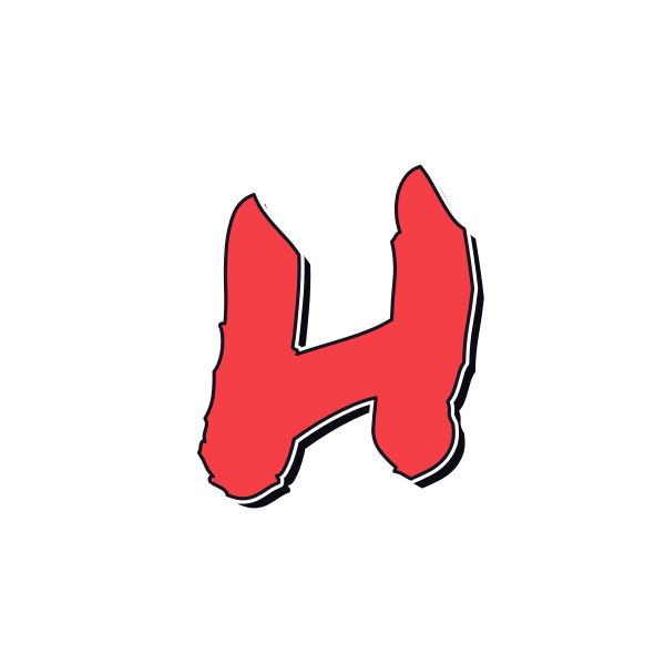
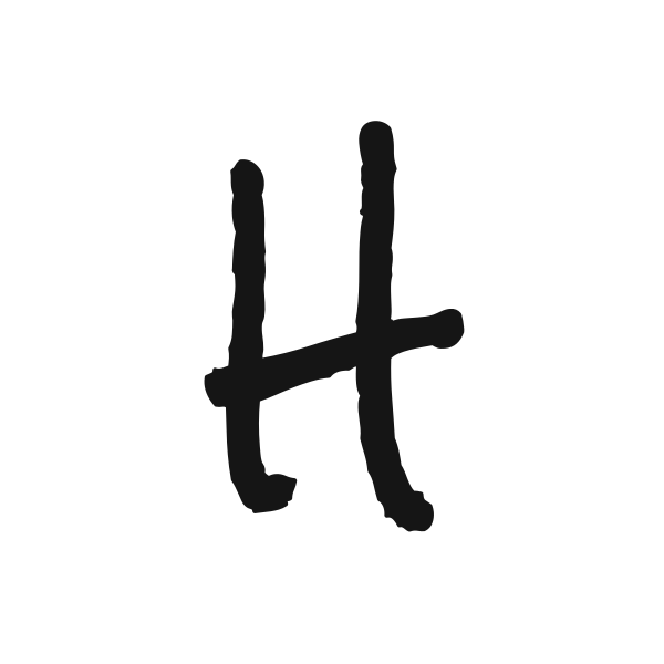
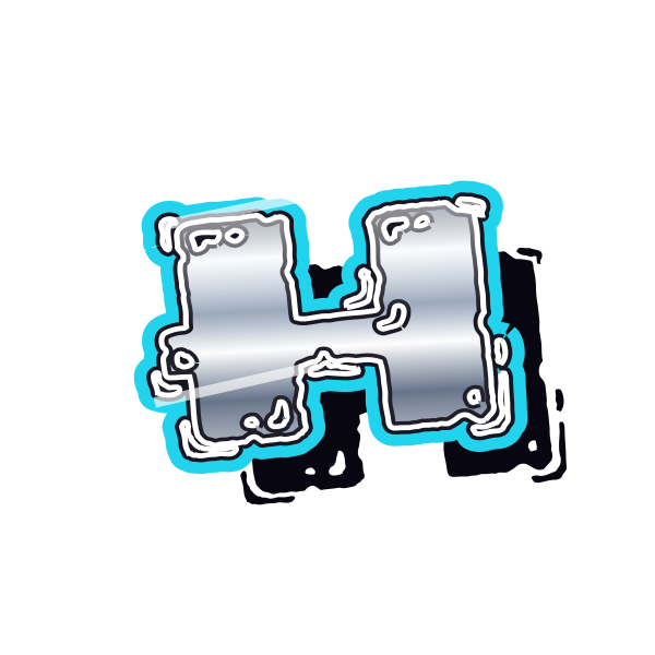
Graffiti letter H has a steady two-sided structure. Its connecting bar can look quiet or dramatic, giving you a choice between balanced display lettering and more expressive handstyles.










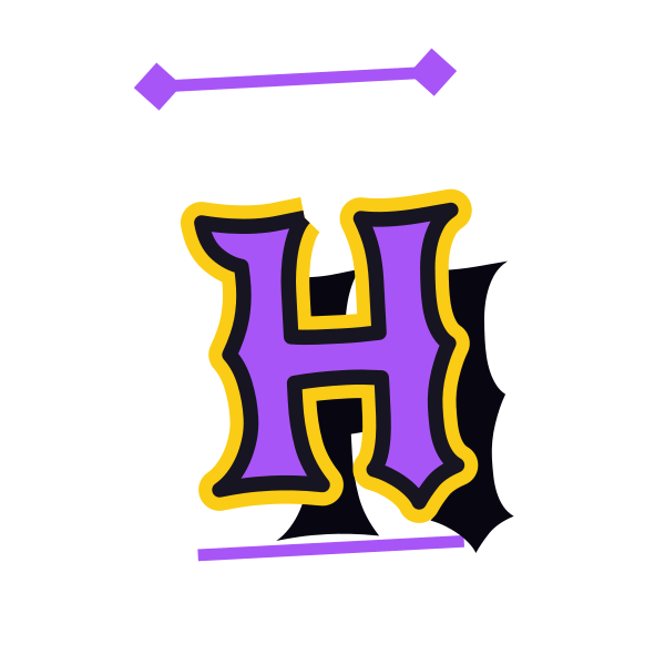
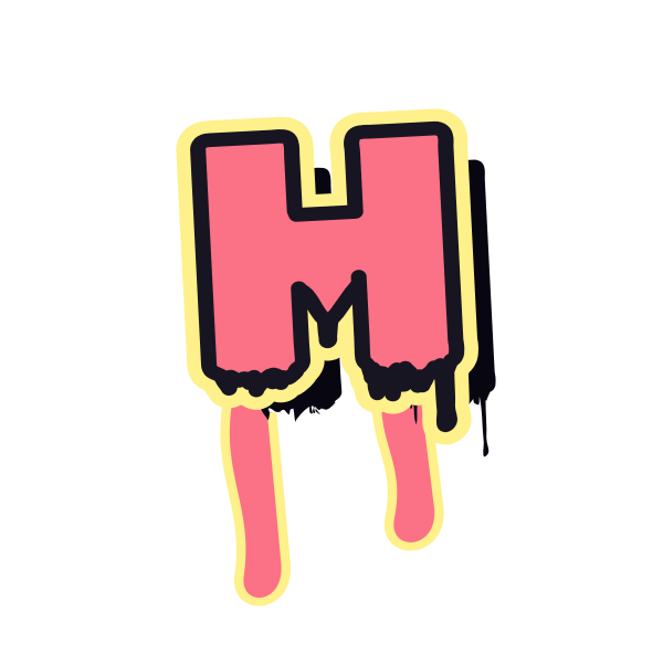

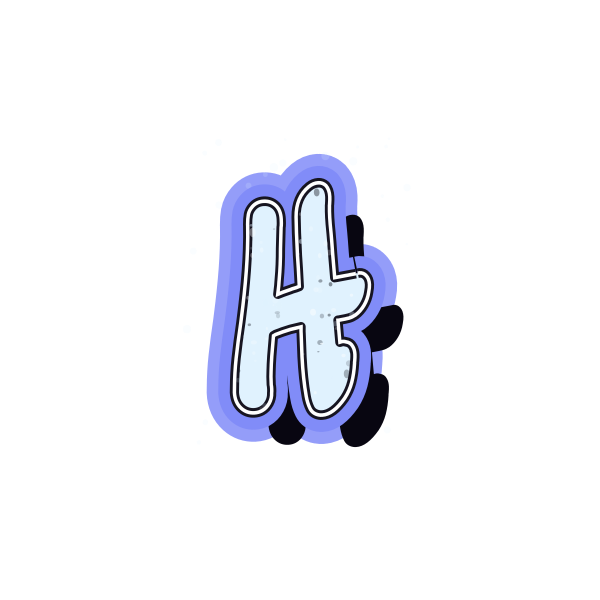
How to use graffiti letter H
- 1
Choose a connection
Look at how clearly the middle bar links the two sides of H.
- 2
Keep a balanced version
Save the design that feels steady in your intended frame.
- 3
Adjust its presence
Open the artwork and resize H without pressing the uprights against the edges.
- 4
Make a paired mark
Enter another initial and compare the space between its strokes and H.
Ideas for your graffiti letter H
Home print
A balanced H can form the center of a personal room decoration.
Horizontal banner
Its two uprights give a broad banner a stable initial anchor.
Header artwork
Use H beside a short heading where a compact symbol is useful.
Hobby journal
Choose a textured treatment for a notebook dedicated to a favorite activity.
Shared initials
H offers a steady starting point for a two-person initial graphic.
Profile tile
A simple bridge keeps the character legible in a small square.
Graffiti letter H FAQs
Should both sides of H have equal weight?
Equal weight gives a formal balance. Uneven or slanted strokes can work when you want a looser tag appearance.
Why is the central bar important in H?
It connects the uprights into one character. If effects hide it, the image may read as two separate strokes.
Which H suits a calm composition?
Start with a straightforward silhouette and restrained shadow, then compare it with the more elaborate previews.
Can I leave the background out of my H image?
The card offers background-free downloads, useful when placing the initial into an existing layout.
How do I use H with my surname?
Open the chosen image in the editor and replace the text with the surname to see the same treatment across it.