Graffiti Letter E
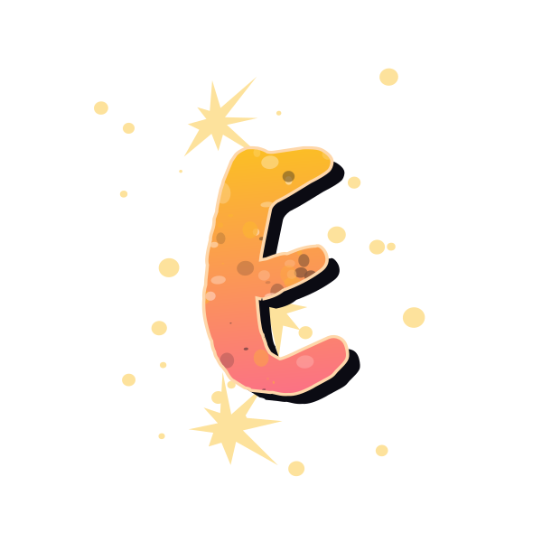
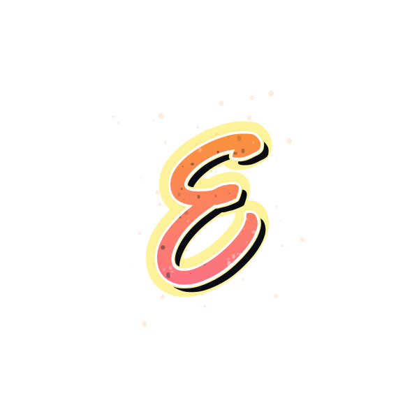
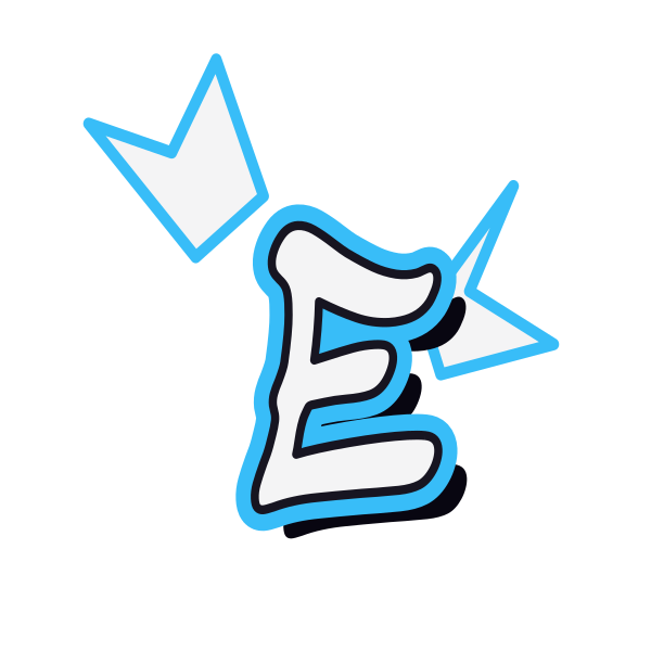
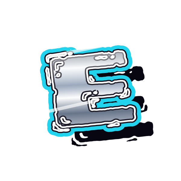
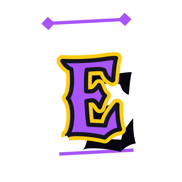
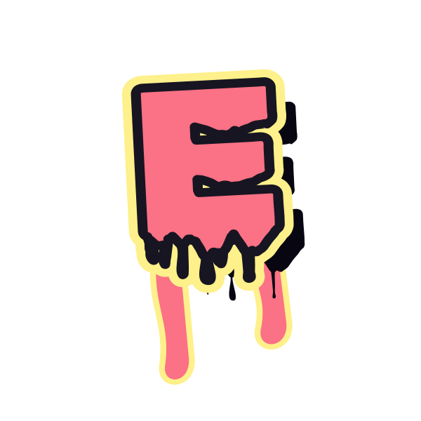
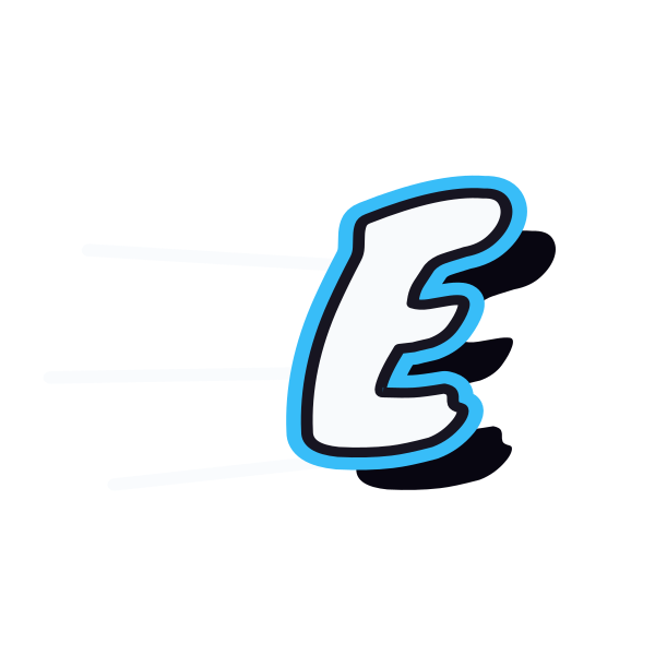
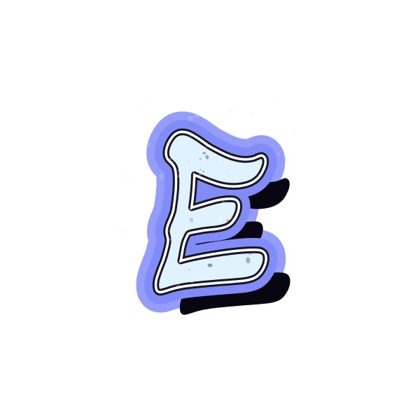
Graffiti letter E brings rhythm through three horizontal strokes. Look across the gallery for different bar lengths, open gaps and the contrast between rounded and squared ends.






How to use graffiti letter E
- 1
Compare the bars
Select an E whose three strokes remain separate at your preferred size.
- 2
Choose the finish
Save a clean outline or a textured version according to your background.
- 3
Open the artwork
Load the selected E on the canvas to experiment with its placement.
- 4
Add your message
Enter a short word and keep the open right side from crowding its neighbor.
Ideas for your graffiti letter E
Editorial initial
E can introduce a personal zine title with a strong vertical edge.
Playlist tile
Short horizontal strokes create a compact mark for a square music cover.
School project title
A readable E works as an accent beside a larger heading.
Personal stamp concept
Compare solid-looking versions for a small initial design study.
Event cover
A sharp E adds direction to an energetic announcement graphic.
Name opener
Use the three bars to lead the eye into the rest of a name.
Graffiti letter E FAQs
Why do some E designs look like F?
A weak or obscured bottom bar can cause confusion. Favor a version with a clear lower stroke.
Which E is easiest to read on a phone?
Look for generous gaps between the three bars and a simple outer contour.
Can the middle bar be shorter?
Yes. A shorter central stroke is common and helps the top and bottom bars define the letter.
How do I keep texture from overwhelming E?
Preview the letter small before choosing. If the gaps fill visually, use a cleaner preset or simplify effects in the editor.
Can I make a matching word from this initial?
Open its preset and enter your text, then review the rhythm of E beside the other characters.