Graffiti Letter P
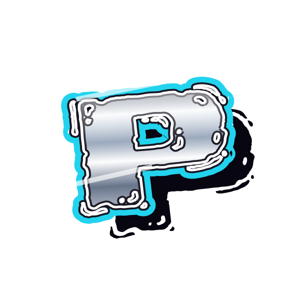
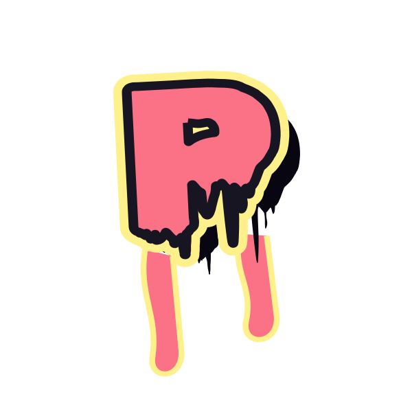
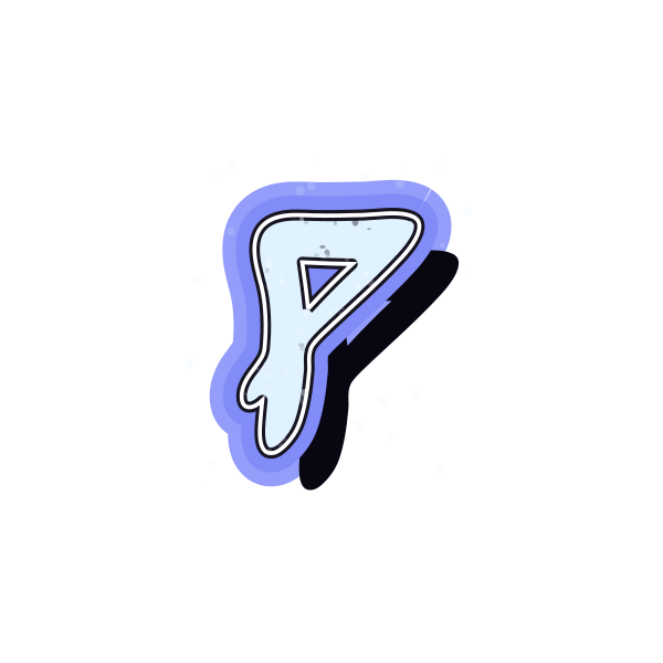
Graffiti letter P concentrates its volume at the top. The contrast between its rounded head and open lower half creates a distinctive initial for compact or airy layouts.

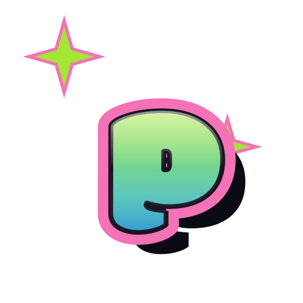




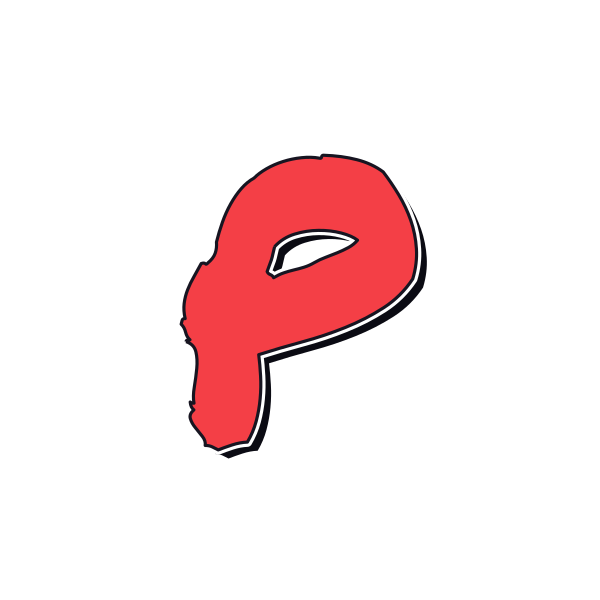
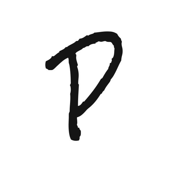



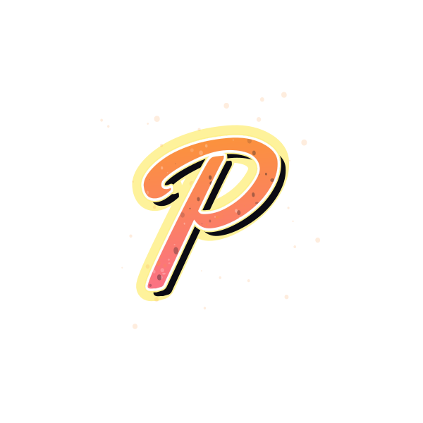



How to use graffiti letter P
- 1
Compare the upper bowl
Select a P with an opening that remains clear at your chosen scale.
- 2
Pick a proportion
Save a tall stem or a broader head according to the available space.
- 3
Balance the initial
Open P on the canvas and leave breathing room beneath its bowl.
- 4
Try your phrase
Enter new text and judge how the next letter occupies the open lower side.
Ideas for your graffiti letter P
Portrait initial
Place a tall P beside a personal portrait with room for the upper curve.
Party invitation
A rounded head offers a soft accent for an initial-led invitation.
Personal packaging mockup
Use P in a label concept for a handmade gift.
Podcast artwork
The strong stem can anchor a short show-name composition.
Page marker
A compact P can identify a section in a personal project journal.
Name combination
Pair the upper bowl with neighboring curves for a flowing name graphic.
Graffiti letter P FAQs
Why can P look like R in decorative lettering?
An extra diagonal near the lower bowl can resemble an R leg. Choose a clear open lower-right area when readability matters.
Does P need equal space above and below?
Not necessarily. Its top-heavy form may look better with extra breathing room around the bowl.
What makes a bubble P recognizable?
A continuous stem and a visible upper opening keep the rounded volume from becoming an abstract blob.
Can I place P on my own colored background?
Save the artwork without the preview background and compare its outline against your selected color.
How can I make P less dominant in a name?
Open the full word in the editor and adjust the selected initial's scale or position relative to its neighbors.