Graffiti Letter W
Graffiti letter W spreads its movement across two lower points. Compare how wide bubble strokes, quick marker lines and angular details affect this naturally broad initial.







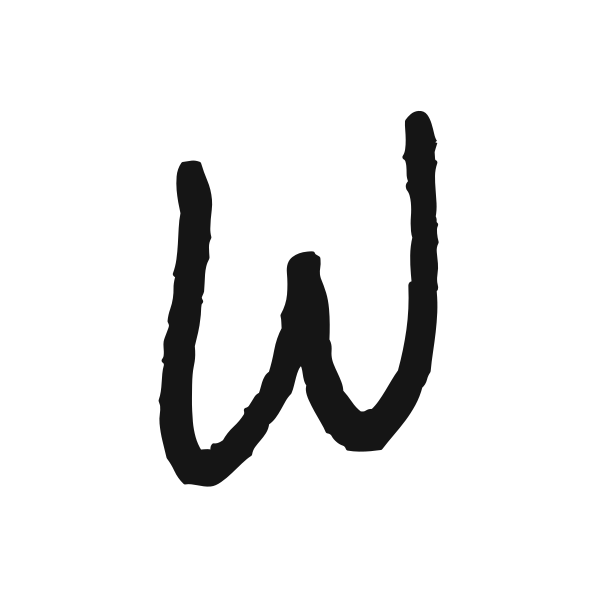





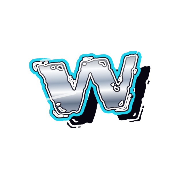

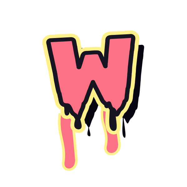

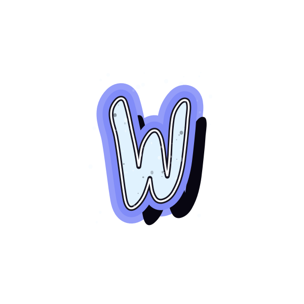
How to use graffiti letter W
- 1
Compare the valleys
Choose a W with two distinct lower turns that remain clear in the preview.
- 2
Plan for the width
Save a design that fits your frame without squeezing its outer arms.
- 3
Scale the whole form
Open the preset and resize W evenly on the canvas.
- 4
Review a complete name
Enter your wording and check how the wide initial balances the remaining letters.
Ideas for your graffiti letter W
Wide cover mark
W can fill a horizontal focal area on a personal cover composition.
Weekend event graphic
Use the initial as a decorative accent on a personal announcement.
Workshop journal
A strong W can identify a notebook for ideas and ongoing projects.
Name banner
Leave room for the broad first letter when arranging a personalized banner.
Contrasting initials
Pair W with a slim character to vary the rhythm of the design.
Personal wall artwork
A generous print area lets both valleys and their effects remain visible.
Graffiti letter W FAQs
Why is W difficult to fit into a small square?
Its width can force the whole letter to become small. Choose a compact preset and preserve space between the main strokes.
How do I avoid making W look like two separate Vs?
Look for a clear central connection and consistent stroke weight across the full silhouette.
Can a bubble W stay readable?
Yes, when its inner valleys remain open. Excessive thickness can merge the middle strokes at small sizes.
Should W be stretched to match a taller initial?
Keep its proportions and align the pair visually. Stretching can change the angles that make it recognizable.
Can I use W in a longer tag?
The selected preset can be opened with your own text, letting you judge the wide character within the complete tag.