Graffiti Letter U
Graffiti letter U brings two sides together in a lower curve. The depth of that curve and the openness above it make the letter feel broad, narrow, relaxed or compact.


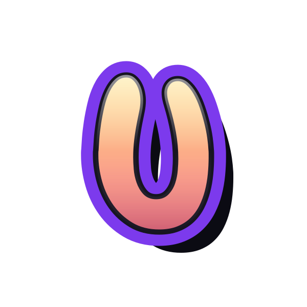



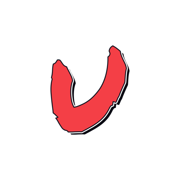
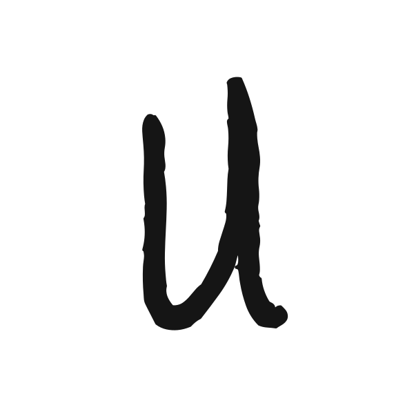






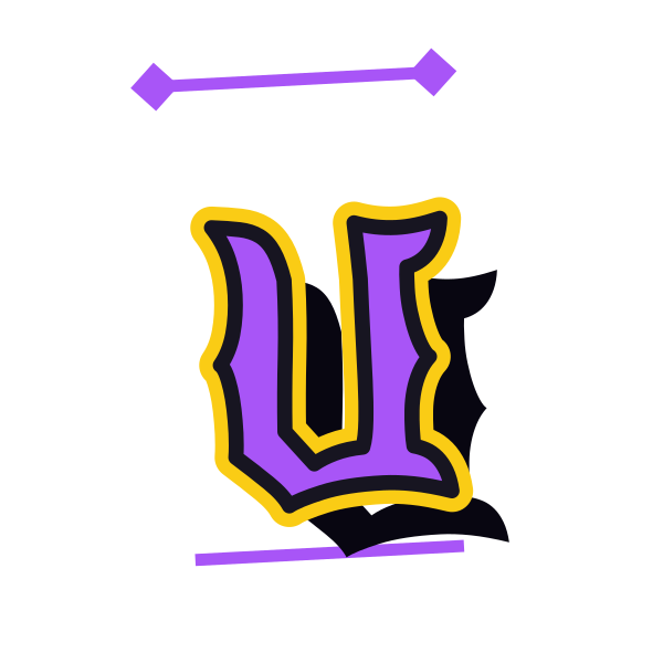
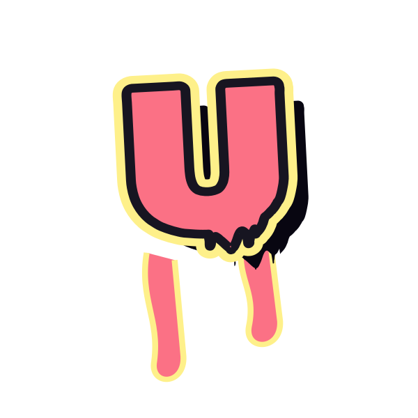

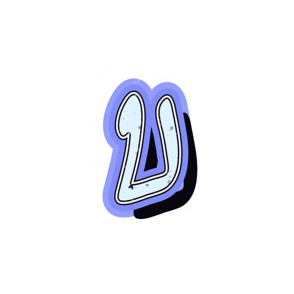
How to use graffiti letter U
- 1
Compare the depth
Look at shallow and deep U shapes to find the proportions you prefer.
- 2
Keep the opening
Save a version that leaves the upper gap clear in a small preview.
- 3
Place the base
Open U on the canvas and allow room below the rounded bottom.
- 4
Try a name layout
Enter your own letters and compare their height with the two uprights.
Ideas for your graffiti letter U
Open-frame accent
U can sit beneath a small visual element as a decorative initial.
University project cover
Use a readable U when it matches the title or subject of a personal project.
Profile symbol
A broad lower curve gives a simple initial a friendly appearance.
Personal sticker sheet
Choose compact uprights for an initial that fits a small label.
Notebook section art
A narrow U can introduce a personal journal section.
Two-letter balance
Pair its rounded base with a sharper initial for visual contrast.
Graffiti letter U FAQs
How is a graffiti U different from V?
The lower join is rounded rather than pointed. Preserve that curve when choosing a small or highly angular design.
Can U look too empty in the middle?
A wide gap creates an airy feel. If you need a stronger mark, compare thicker strokes rather than adding unrelated decoration.
Which U suits a soft visual style?
A continuous rounded base and gently curved ends emphasize the letter's natural softness.
How should I crop U for an avatar?
Leave a margin beneath the base and around both top ends so the open shape stays complete.
Can I place U into an existing design?
Save the background-free artwork and position it with enough contrast for both upright edges to show.