Graffiti Letter M
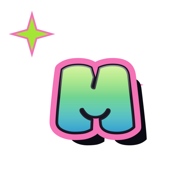
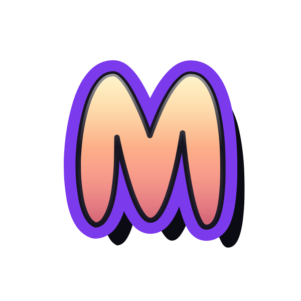
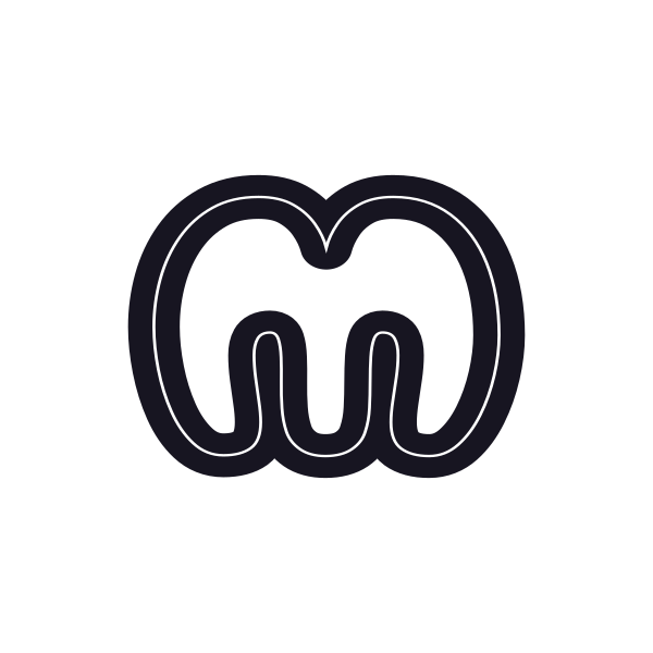
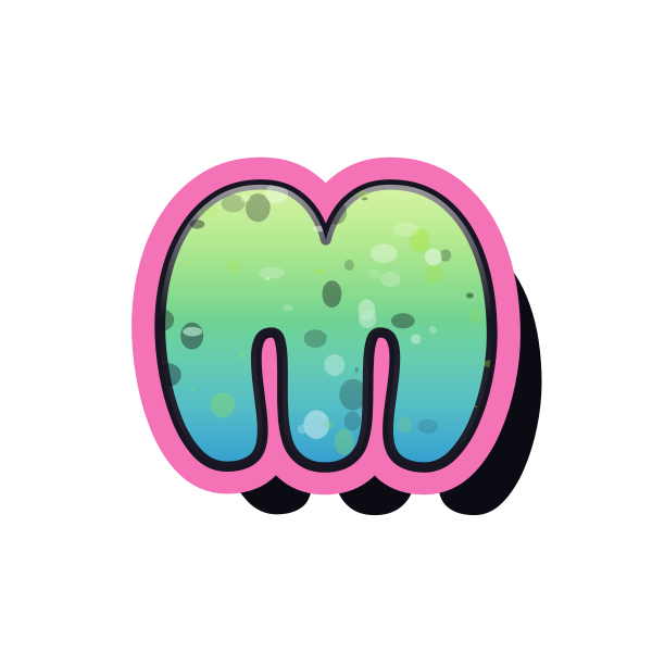
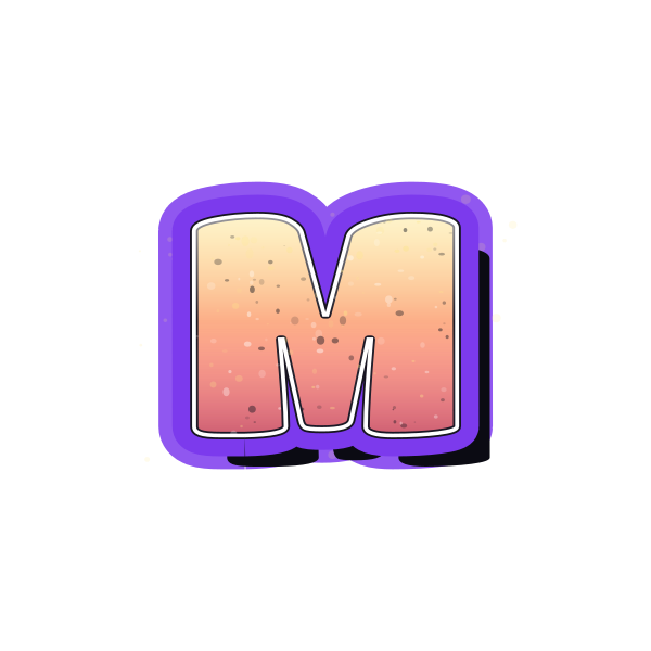
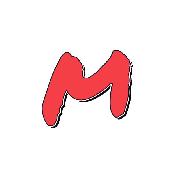
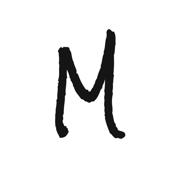
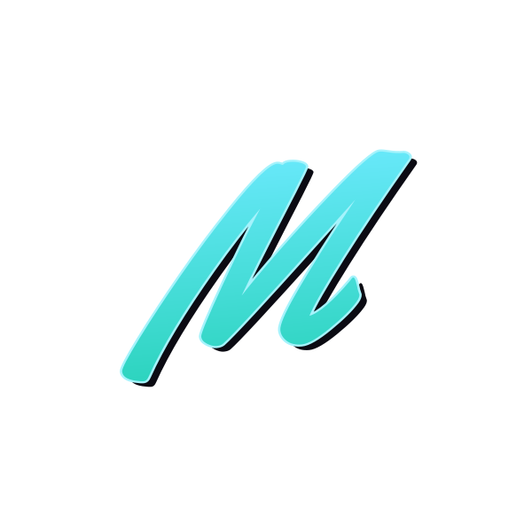
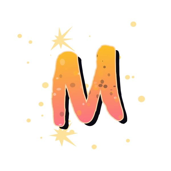
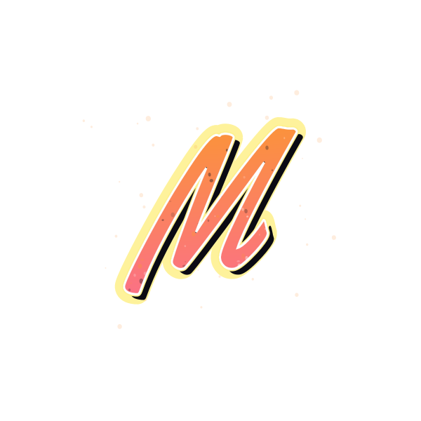
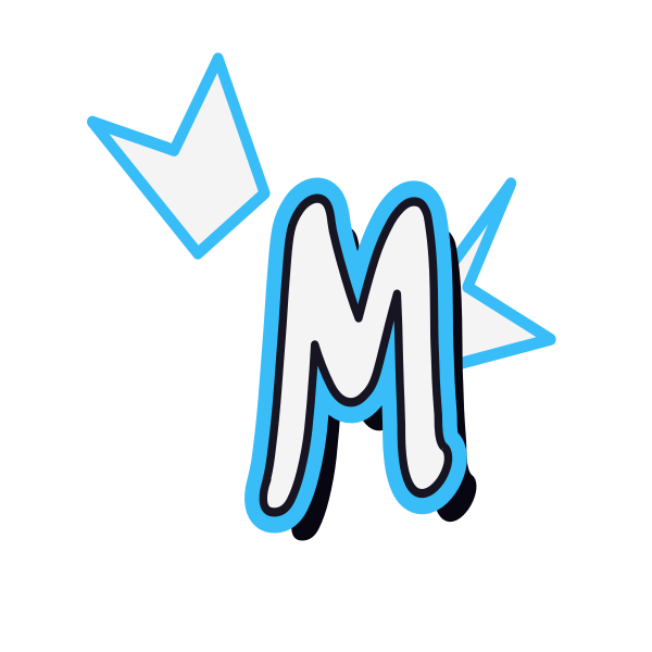
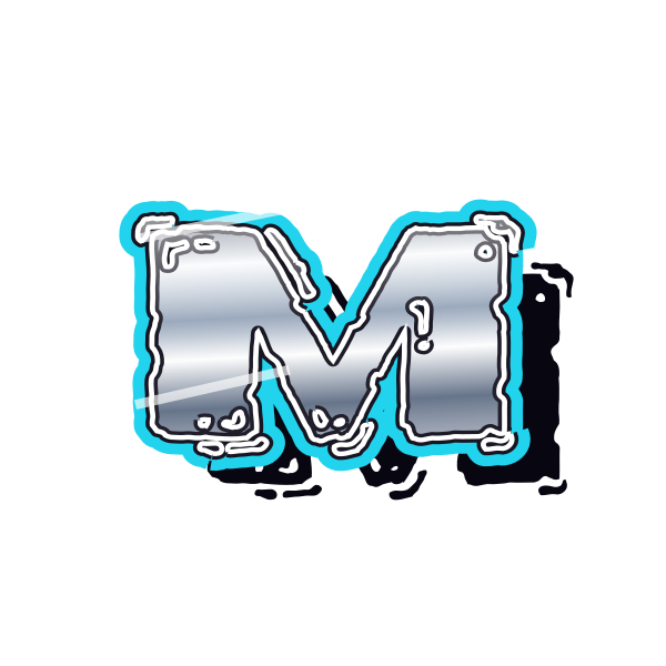
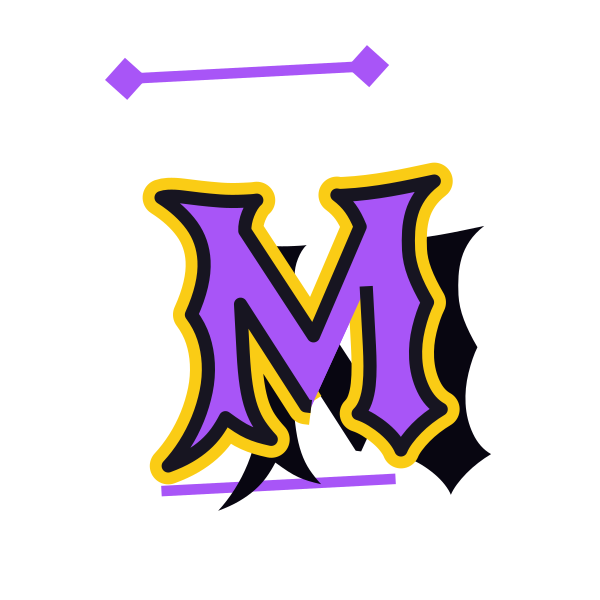
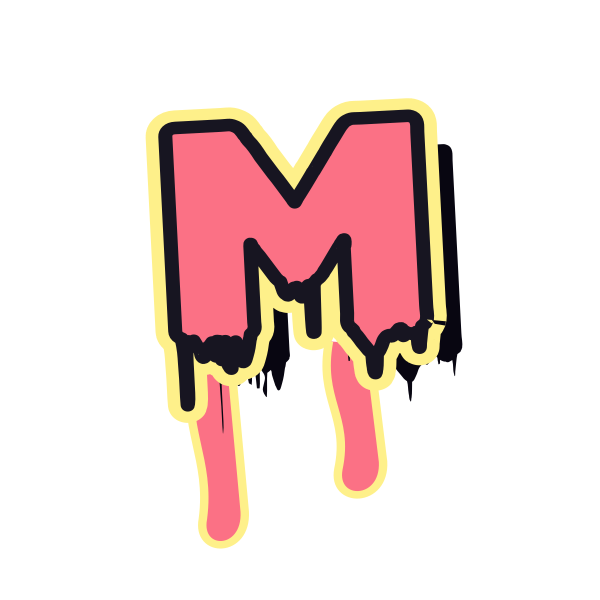
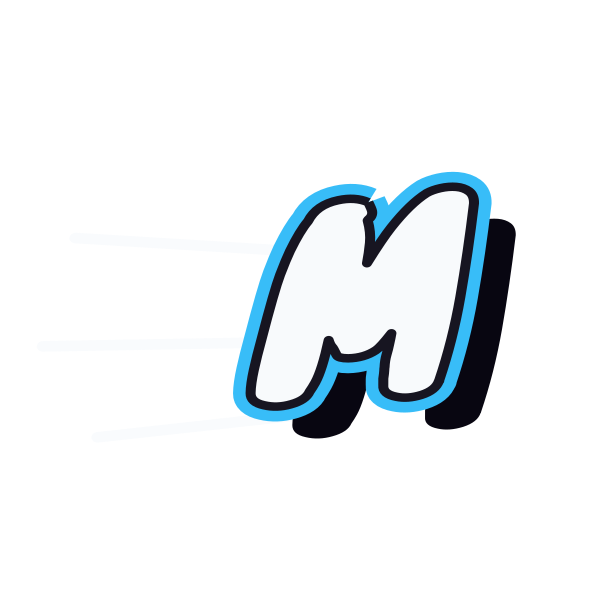
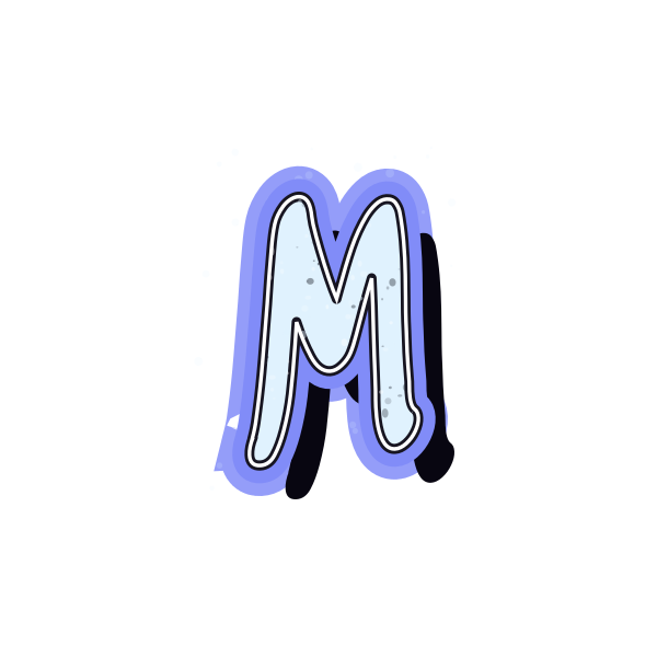
Graffiti letter M fills space with two peaks and a central valley. These previews let you compare broad, rounded volume with tighter marker strokes and angular forms.


How to use graffiti letter M
- 1
Compare the width
Choose an M that fits your layout without compressing its two outer sides.
- 2
Keep the valley clear
Save a design whose center remains distinct beneath the decorative effects.
- 3
Size it together
Open the preset and scale the artwork evenly to preserve its proportions.
- 4
Preview your name
Add your text and check spacing around this naturally wide initial.
Ideas for your graffiti letter M
Banner centerpiece
M can occupy a broad central area in a personal name banner.
Music identity graphic
Twin peaks give an initial-led playlist cover a strong rhythm.
Wide sticker layout
Let the broad form fill a horizontal label without squeezing it.
Matching initials
Pair M with a narrow letter for a balanced contrast in width.
Room decoration
A rounded version makes a substantial personal wall-print initial.
Notebook title
Use a clear M to begin a short title across the cover.
Graffiti letter M FAQs
Why does M look crowded in a small icon?
Its four main strokes share a limited area. A simple contour and open center help when the image is reduced.
Should I narrow M to match other initials?
Prefer uniform scaling or a naturally narrower preset. Horizontal compression can distort the valleys and stroke weight.
How is M different from an upside-down W?
Stylized forms may look similar, but their joins and proportions are designed for their orientation. Use the dedicated M preview.
Which M suits a wide cover?
A broad bubble or angular version can fill the space; leave a margin beyond the outside strokes and effects.
Can I try M at the start of a longer name?
Yes. The editor loads the chosen initial and preset, and you can replace the text with the complete name.