Graffiti Letter B
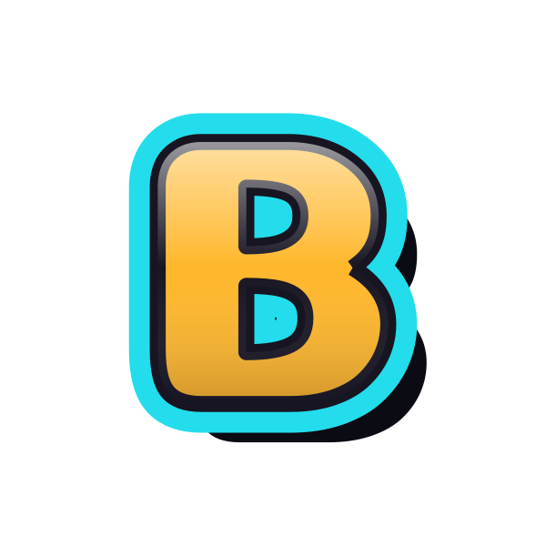
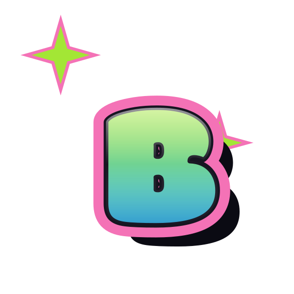
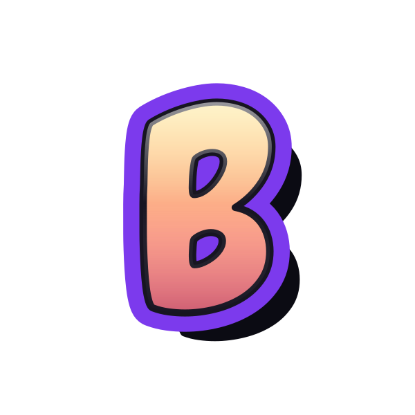
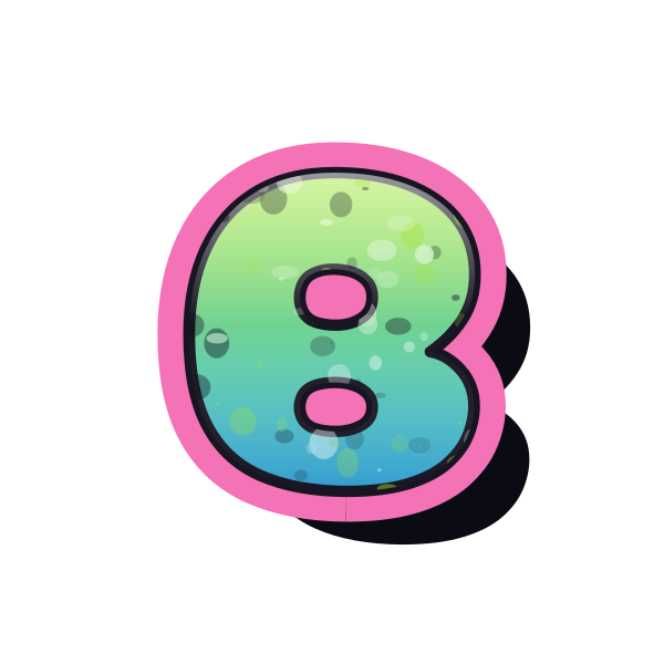
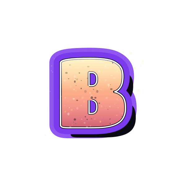
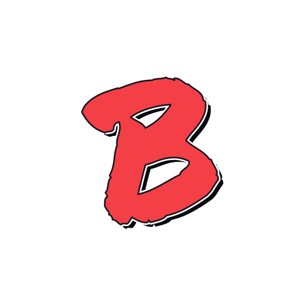
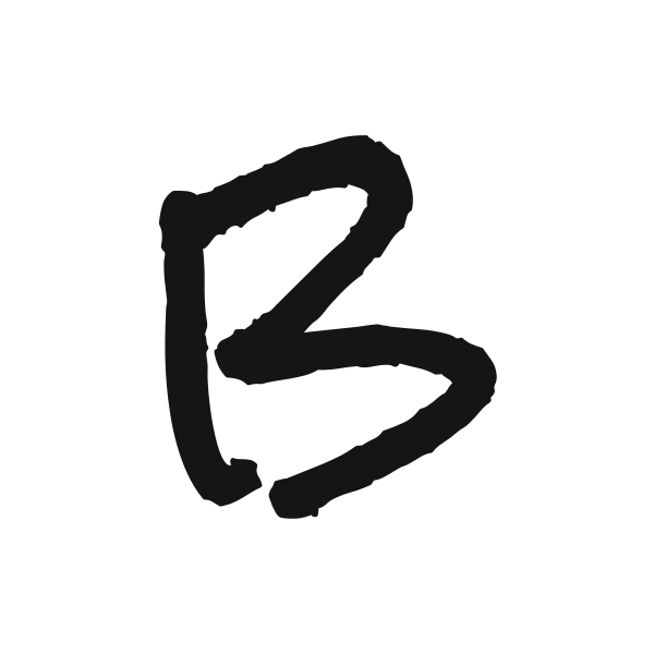
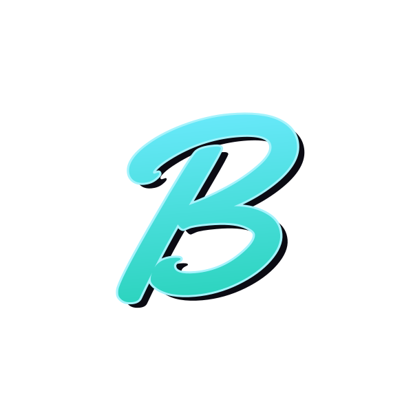
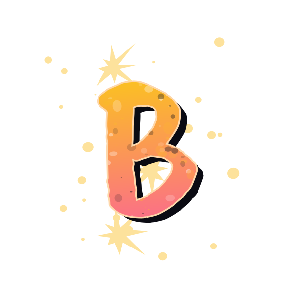
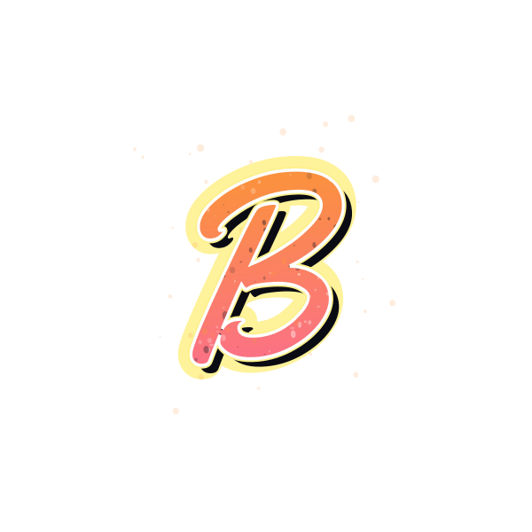
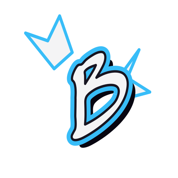
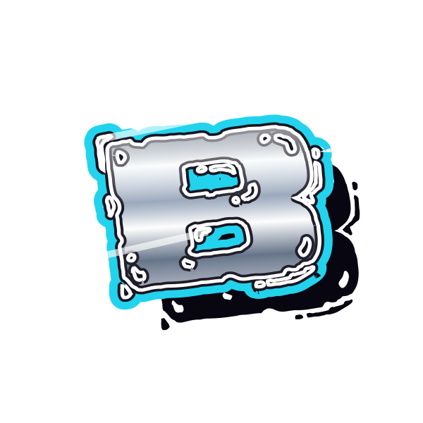
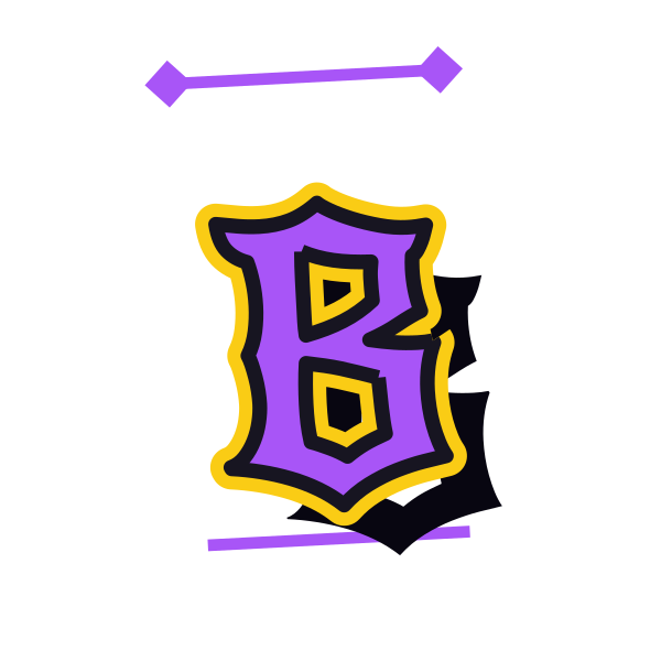
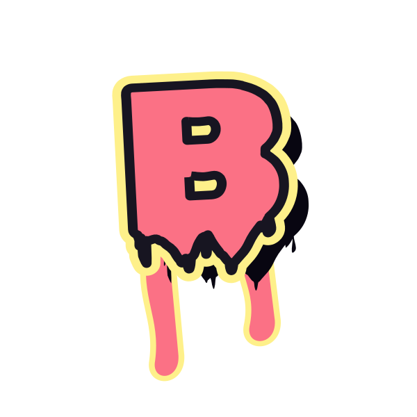
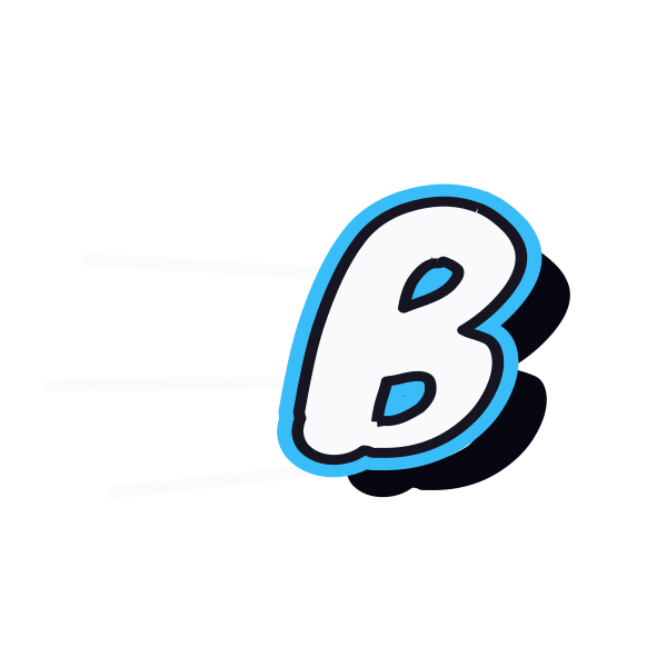
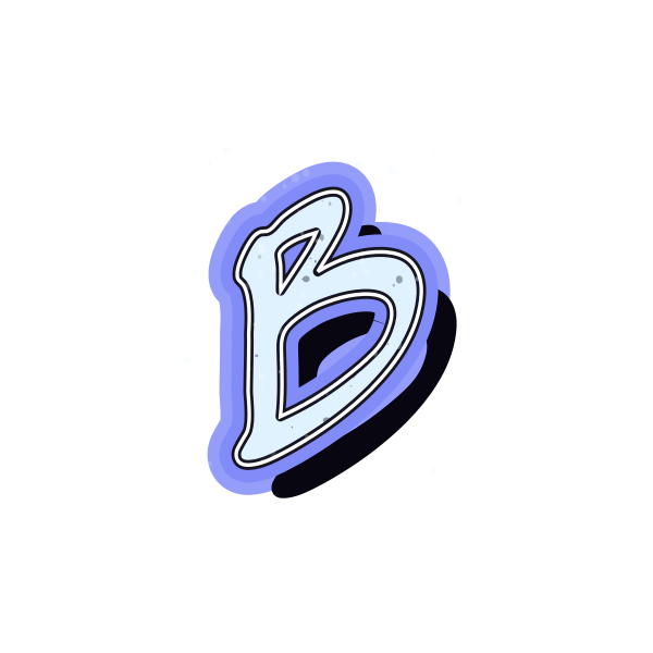
Graffiti letter B has two rounded sections that can feel playful, compact or heavy. Compare how each design balances its straight spine with those outward curves.

How to use graffiti letter B
- 1
Balance the bowls
Look for a B whose upper and lower sections suit your intended size.
- 2
Save a clear preview
Use the image controls to keep the design with the strongest middle notch.
- 3
Adjust the mood
Open the selected B in the editor to change its color or placement.
- 4
Build your lettering
Enter a longer name and give the broad right side enough breathing room.
Ideas for your graffiti letter B
Round badge
The curved side of B sits comfortably inside a generously spaced badge.
Book cover accent
A large B can identify a personal collection or illustrated booklet.
Birthday initial
Choose soft bowls for a friendly initial on a celebration graphic.
Music thumbnail
A heavy outline helps a B remain visible beside a short track title.
Personal sticker
Keep both enclosed spaces readable when sizing a small sticker layout.
Name signature
Pair a marker-style B with flowing letters for a loose handwritten feel.
Graffiti letter B FAQs
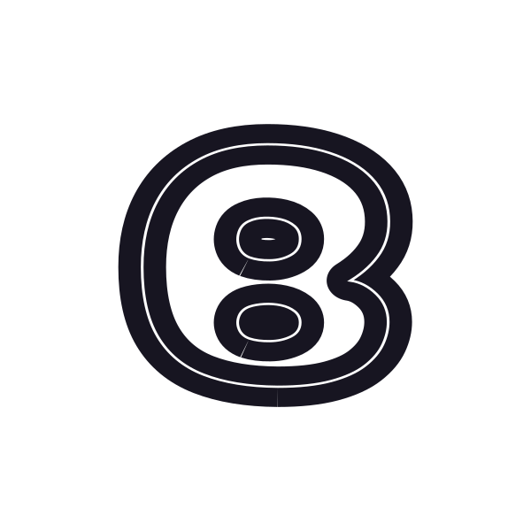
Why does a decorated B sometimes resemble an 8?
The straight left spine can disappear under thick effects. Choose a design where that edge stays visible.
Should the two bowls of B be identical?
They do not have to be. A slightly larger lower bowl can give the initial a steadier base.
Which B is better for a friendly design?
Rounded bubble forms tend to feel softer, while sharper extensions make the same letter more assertive.
Can I change the fill without picking another B?
The image action opens its preset in the editor, where you can recolor the lettering while keeping that selection.
How much room does B need next to another initial?
Start with enough space for its right-hand curves. Preview the pair at its final size before saving.