Graffiti Letter F
Graffiti letter F leaves its lower right side open. That asymmetry gives the letter a light, forward-reaching feel even when its upper strokes are thick and bold.






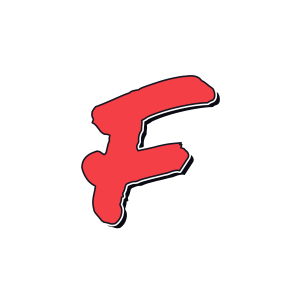
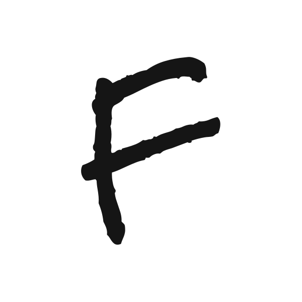





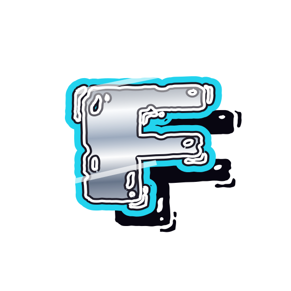

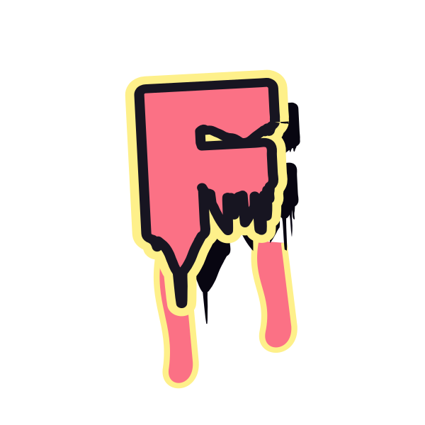

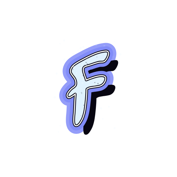
How to use graffiti letter F
- 1
Look at the reach
Choose an F with upper bars that fit your composition without dominating it.
- 2
Save the silhouette
Keep the preview whose open lower half remains easy to recognize.
- 3
Tune the placement
Bring F into the editor and position it with room beneath the top bar.
- 4
Try neighboring letters
Enter a name and check how its next character fills the open side.
Ideas for your graffiti letter F
Fashion moodboard
An elongated F can anchor a personal lettering concept sheet.
Profile initial
Use a compact treatment that leaves room around its upper arm.
Flyer margin
Place the straight spine near an edge to introduce a short title.
Folder cover
A restrained F gives a personal project folder an identifiable mark.
Skate graphic idea
A quick handstyle suits an informal board artwork mockup.
Two-character tag
Let a second initial balance the empty lower-right area.
Graffiti letter F FAQs
How can I keep F distinct from E?
The lower right must remain open. Decorative strokes near the base should not resemble a third bar.
Does F look off-center in a square?
It can, because most of its width sits near the top. Position it by visual balance rather than equal margins alone.
Which treatment softens the shape of F?
Rounded ends and bubble strokes make its right angles feel less rigid.
Can I use the empty area beside F?
Yes. Small supporting text can sit there, provided it does not merge into the letter.
How do I change the color of my selected F?
Open that preview in the editor and use the lettering color controls before saving the result.