Graffiti Letter L
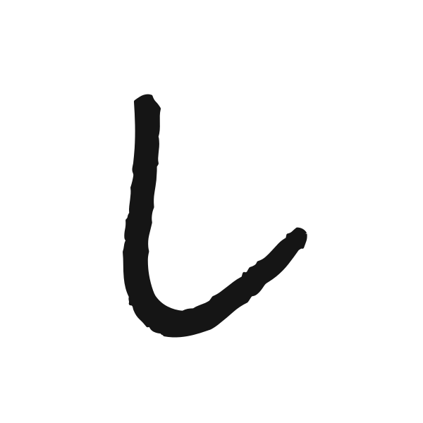
Graffiti letter L has a simple corner-shaped silhouette. Its long upright and lower foot offer a quiet foundation for bold fills, soft volume or lively marker texture.

















How to use graffiti letter L
- 1
Choose the foot
Compare short and extended lower strokes to find the right balance.
- 2
Save a fitting shape
Pick a preview that fits beside the text or picture you plan to use.
- 3
Place the corner
Open L in the editor and position its base without crowding the edge.
- 4
Add the next letter
Enter your wording and check the space above the extended foot.
Ideas for your graffiti letter L
Layout corner
L can mark the lower-left corner of a personal graphic composition.
Library notebook
Use a restrained initial to identify a reading journal or book list.
Landscape cover
Its upright can balance a wide image on a personal cover.
Letter pair
The open upper-right area gives a second initial room to stand beside it.
Simple sticker
A strong outline helps this sparse letter hold its own on a small label.
Name introduction
A longer foot can visually lead into the rest of a short name.
Graffiti letter L FAQs
How do I keep L from looking like I?
Choose a visible lower foot. Very narrow or heavily cropped versions can lose that important distinction.
Does L need decoration to look complete?
No. Its simple silhouette can work through proportion and contrast alone, especially in a minimal layout.
Where should I place L in a square?
Account for the weight of its lower stroke; equal spacing around the stem may not look visually centered.
Can I put another initial above the foot?
You can arrange a pair that way, but leave enough separation for both letters to remain readable.
How do I make the L treatment match a full word?
Open its preview in the editor and enter the word to compare the same preset across all characters.