Graffiti Letter A
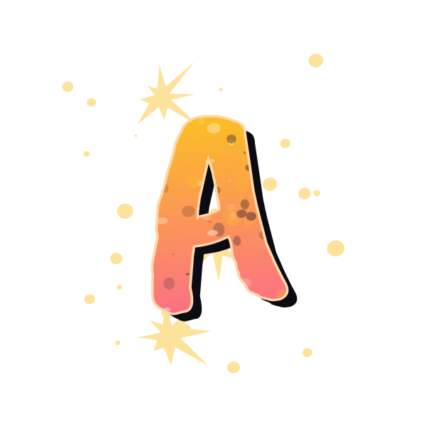
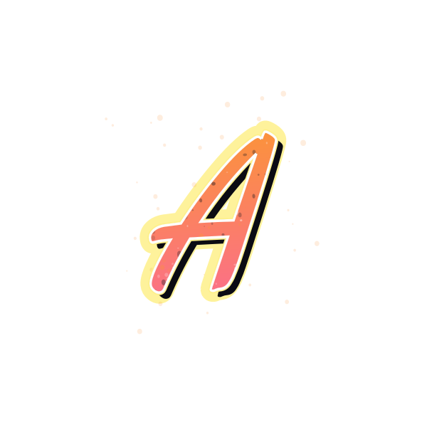
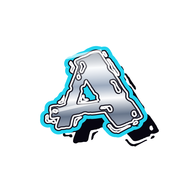
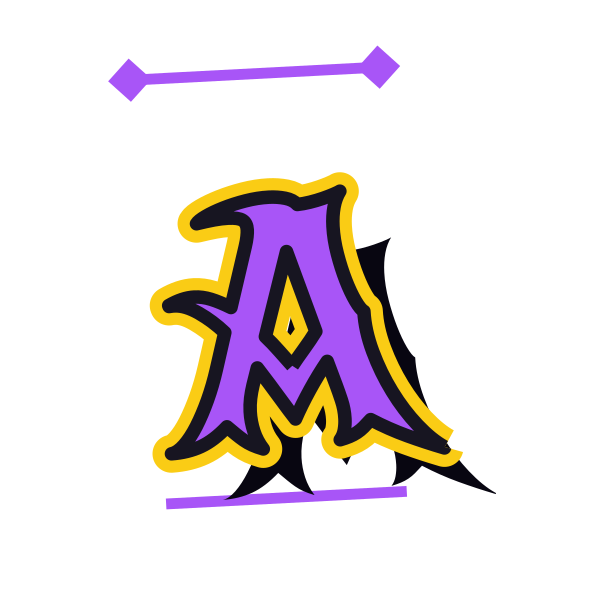
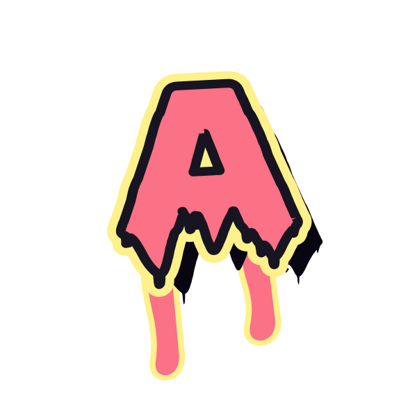
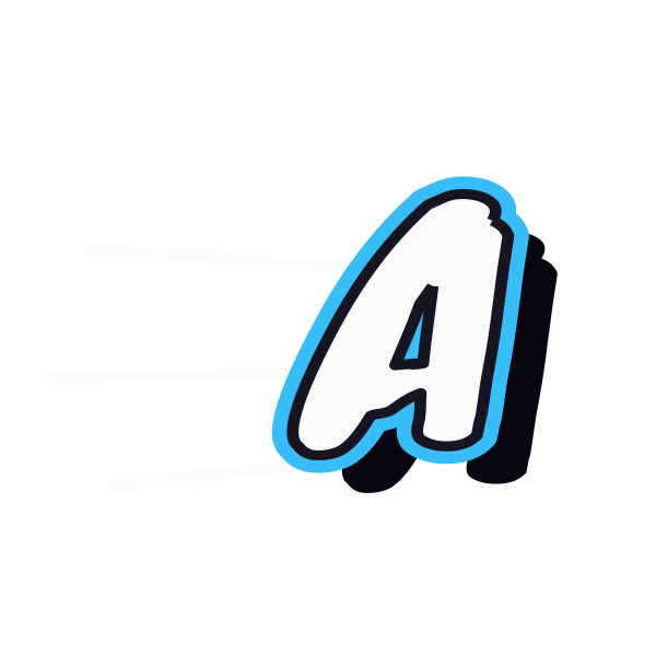
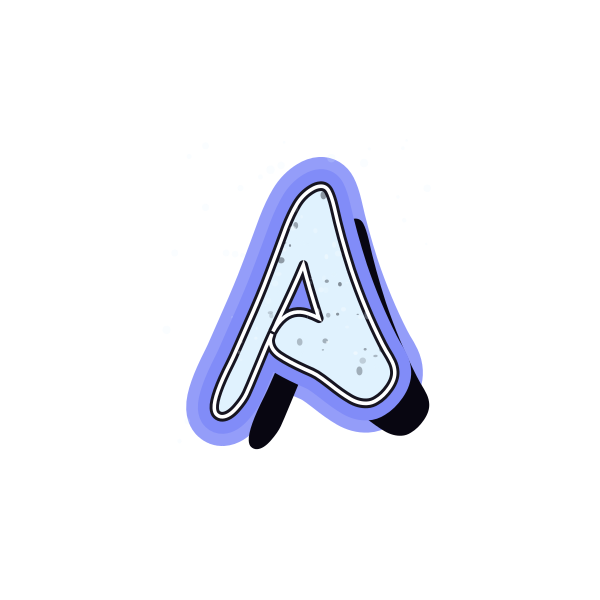
Graffiti letter A combines a strong peak with an open center. Explore rounded bubble forms, quick tag strokes and angular treatments for a distinctive first initial.
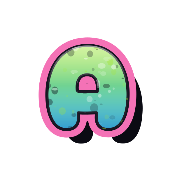

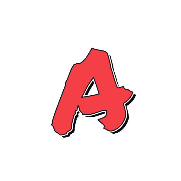
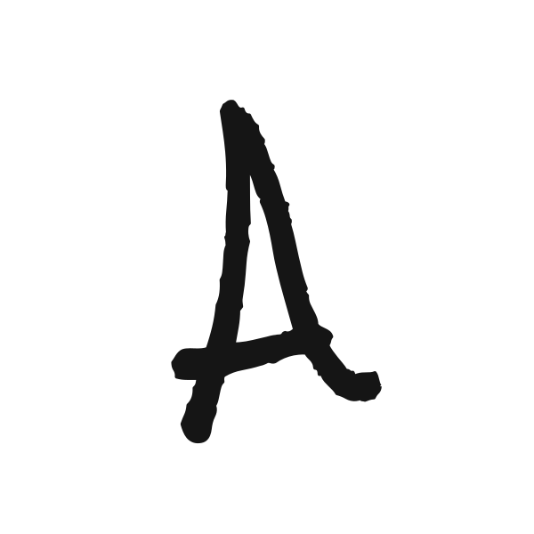
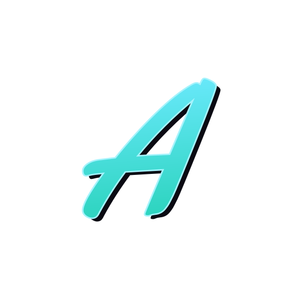


How to use graffiti letter A
- 1
Compare the peak
Choose a pointed or rounded A to match the mood of your project.
- 2
Keep a favorite
Reveal its image actions and save the version with the clearest center.
- 3
Open your selection
Take that A into the editor with its colors and lettering already selected.
- 4
Try a name
Replace the initial with your name and review the space beside its sloping sides.
Ideas for your graffiti letter A
Personal avatar
A broad A gives a short profile name a recognizable visual anchor.
Album initial
Place the peak beneath a cover title for a deliberate central accent.
Notebook mark
Use a compact A to identify a personal sketchbook or journal.
Event lettering
An oversized initial can introduce a name on a party poster.
Paired initials
Leave room between A and a second character so their diagonals stay distinct.
Decorative print
A rounded treatment adds a softer note to a personal wall print.
Graffiti letter A FAQs
Which A works best at a small size?
Choose a version with a visible crossbar and open center. Heavy detail can close that space when reduced.
Can a bubble A still have a pointed top?
Yes. Bubble describes the rounded volume of the strokes; the overall silhouette can retain a peak.
How should I place A in a circular avatar?
Leave space above the apex and below both feet so the circle does not crop the letter.
Can I put this initial over a photograph?
Choose a transparent-background download and place it over a quiet area of the photo to preserve the inner opening.
Will the same style work for a whole name?
Open the chosen design in the editor and enter the name. Check spacing where the sloping side meets the next letter.