Graffiti Letter V
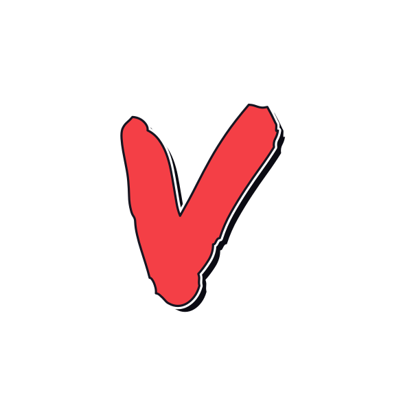
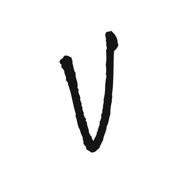
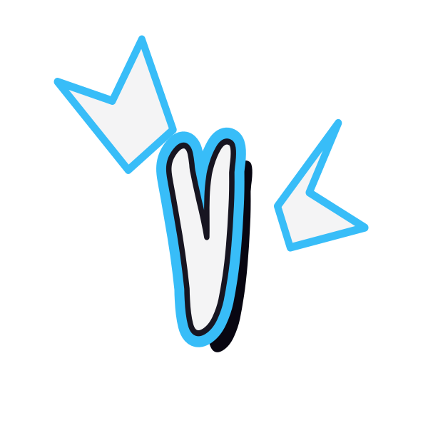
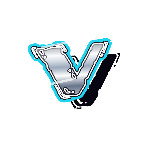
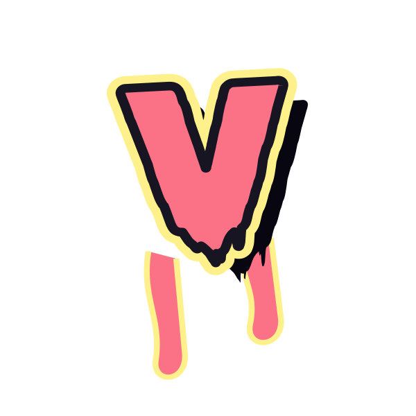
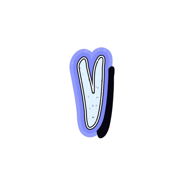
Graffiti letter V draws attention to a single lower point. Its open upper arms give you a choice between a crisp angular mark and a fuller, softer silhouette.












How to use graffiti letter V
- 1
Choose the point
Compare a sharp lower join with rounded treatments before picking your V.
- 2
Save the right spread
Select a design whose arms fit the available width without crowding.
- 3
Balance the angle
Open V in the editor and leave space beneath its lowest point.
- 4
Add a second initial
Enter your text and inspect the gaps beside the outward-sloping arms.
Ideas for your graffiti letter V
Personal emblem study
A simple V makes a clear starting point for an initial-based composition.
Video cover accent
The pointed silhouette can direct attention toward a short subtitle.
Vertical poster detail
Place V above supporting text with its tip pointing into the layout.
Notebook symbol
A broad outline gives a small personal initial more presence.
Contrasting letter pair
Use V beside a rounded character for a mix of open angles and curves.
Celebration artwork
A softer version can personalize a card without a full name.
Graffiti letter V FAQs
What keeps V distinct from U?
Its bottom point is the clearest cue. Even a rounded treatment should preserve a recognizable angled join.
Does V need more space at the top?
Its arms spread outward, so the top usually determines its width. Keep both ends inside your final crop.
Which V is easiest to recognize quickly?
A clean two-arm silhouette works well. Heavy extensions can compete with the main point in a small image.
Can V look balanced beside a straight letter?
Yes, but its sloping sides create uneven-looking gaps. Preview the pair together and adjust placement if needed.
How can I change the selected V without starting over?
Open its preset on the canvas to adjust the current artwork, then save the version you prefer.