Graffiti Letter G
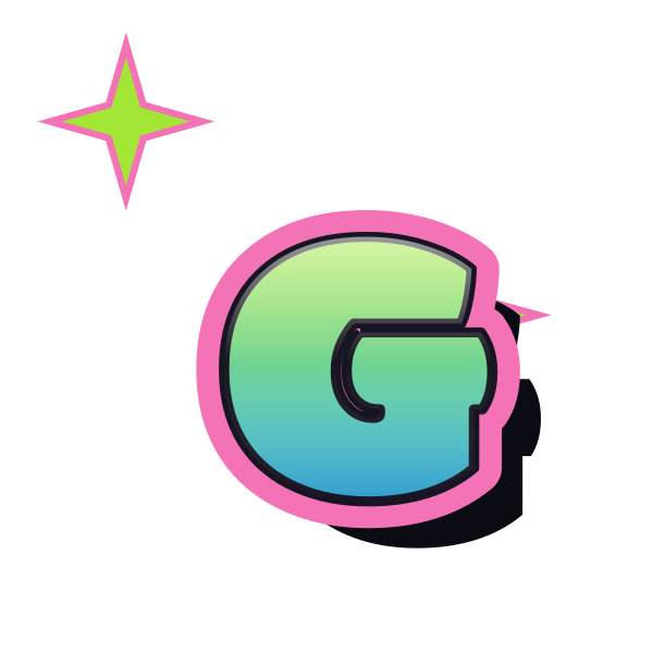
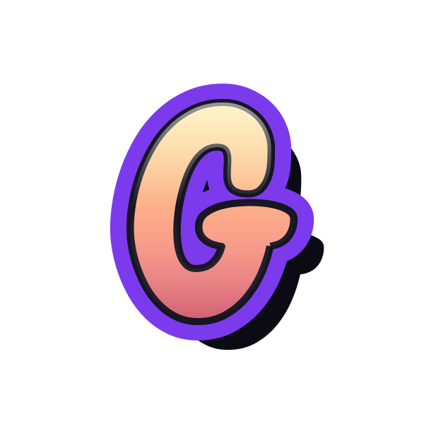
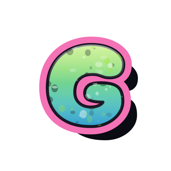
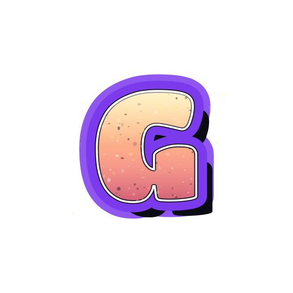
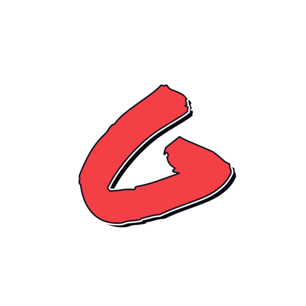
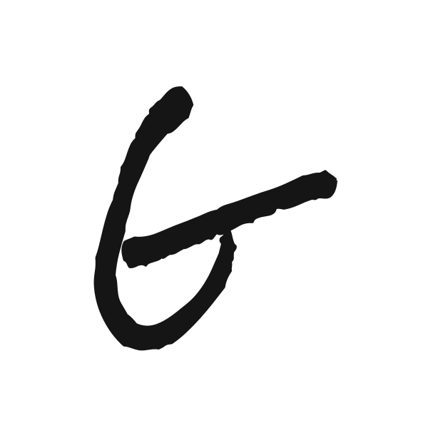
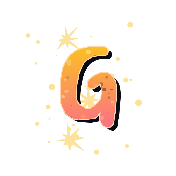
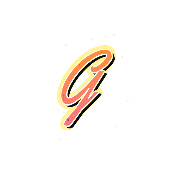
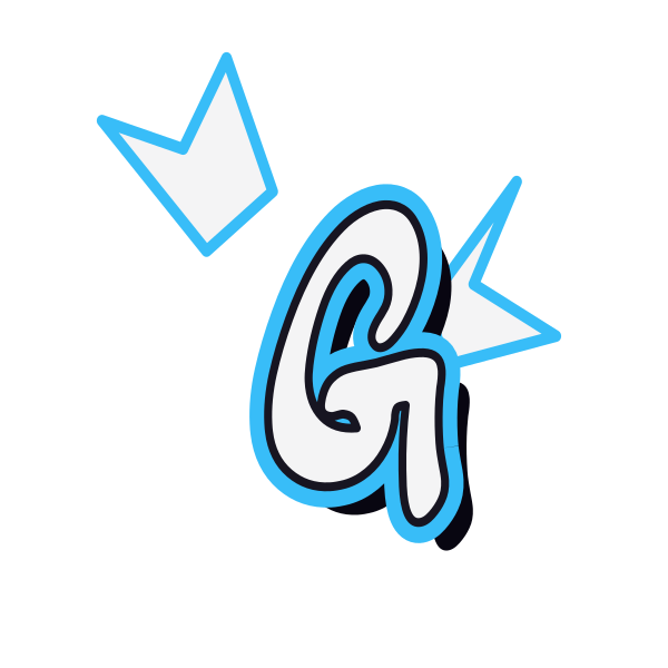
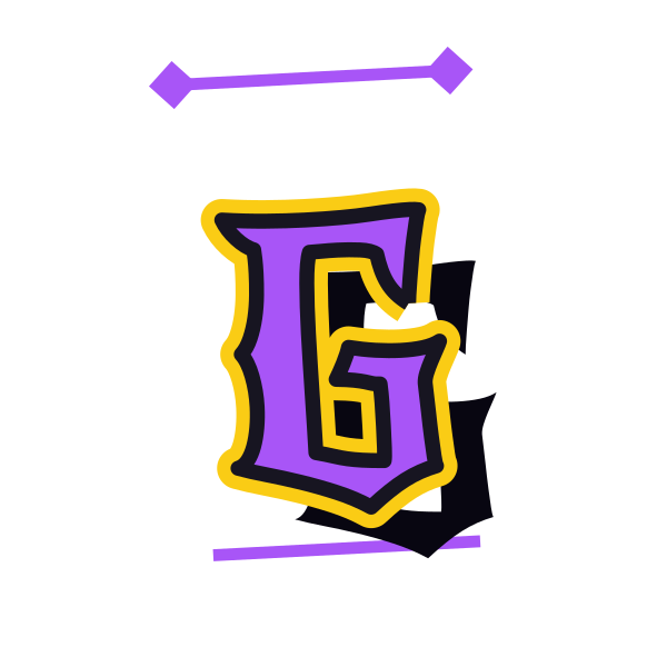
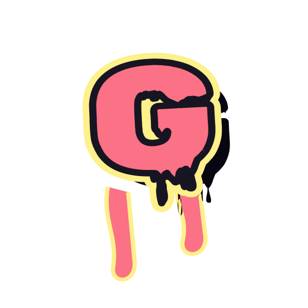
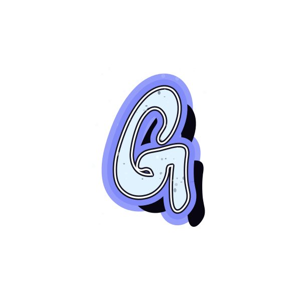
Graffiti letter G adds an inward turn to a rounded body. The relationship between that turn and the open side gives each treatment its own character.






How to use graffiti letter G
- 1
Find the inner turn
Compare G designs with a clear hook rather than a crowded center.
- 2
Select the contrast
Save a preview whose inner detail stands out against its fill.
- 3
Position your initial
Open the design and leave room around both the curve and the hook.
- 4
Test a longer tag
Enter your text and see whether the G remains distinct at the start.
Ideas for your graffiti letter G
Gaming avatar
A bold G can identify a personal profile without a full username.
Groove-inspired cover
The curved body gives a music graphic a rounded focal point.
Gift initial
Use a softer treatment on a personalized card or wrapping layout.
Group lettering study
Compare angular versions for a shared initial concept.
Sketchbook cover
A textured G adds character to a personal art notebook.
Short name graphic
Choose a clear inner turn when G leads a compact word.
Graffiti letter G FAQs
What separates a graffiti G from C?
The inward bar or hook provides the key difference. It should remain visible when the image is reduced.
Why does the middle of G look crowded?
Its inner turn competes with the surrounding curve. A wider opening or simpler outline usually reads more clearly.
Is G a good fit for a round avatar?
Its curved body can work well, but keep the right-hand detail away from the crop.
Can I place G over a busy picture?
Use a background-free image with enough outline contrast, and choose a quieter part of the picture for the hook.
How can I compare G in a full username?
Load the preferred preset into the editor and enter the username so you can judge the whole word together.