Graffiti Letter S
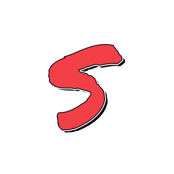
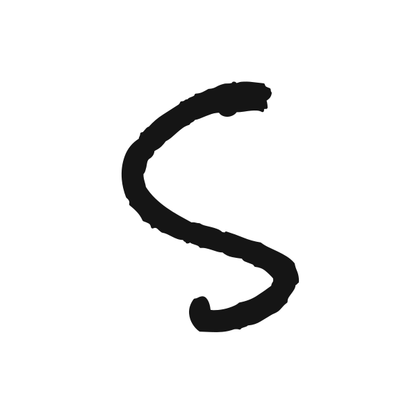
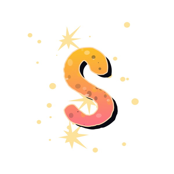
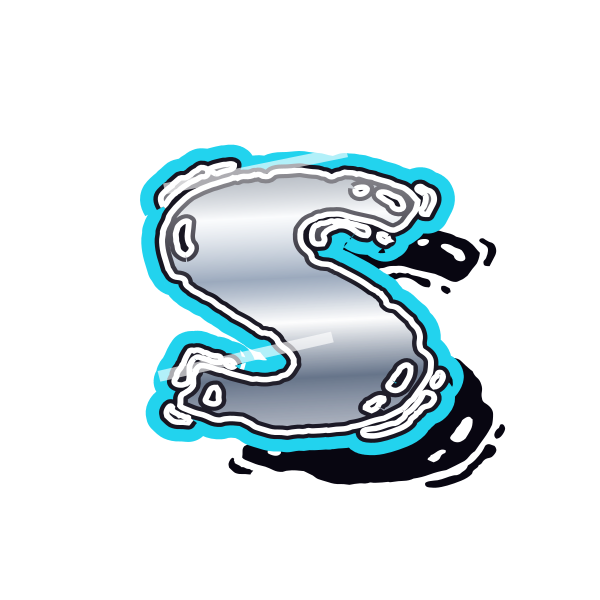
Graffiti letter S moves through two opposing curves. Its narrow middle and broad ends can look fluid, weighty or sharp depending on the treatment you choose.











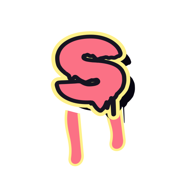

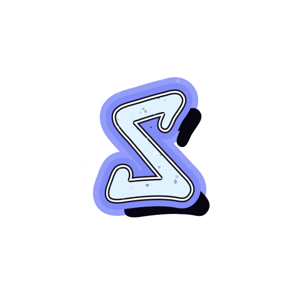
How to use graffiti letter S
- 1
Follow the curve
Compare the flow from the top of S through its waist to the lower end.
- 2
Choose a clear outline
Save the version whose central bend stays distinct when viewed small.
- 3
Set the mood
Open S in the editor and adjust its color to suit your composition.
- 4
Extend the flow
Enter a name and compare the curved initial with the letters that follow.
Ideas for your graffiti letter S
Social profile accent
A simple S offers a recognizable curved mark for a personal avatar.
Soundtrack cover
Use a flowing treatment to complement a music-inspired graphic.
Scrapbook initial
A rounded S can soften the edges of a personal collage page.
Skate artwork concept
An angular S adds a more restless feel to an illustration mockup.
Name ribbon
Place a clear S at the start of lettering across a wide banner.
Gift card detail
A compact curve makes a small personalized accent near a message.
Graffiti letter S FAQs
Why is a heavily decorated S hard to read?
Details can hide its narrow waist and the direction of its ends. Compare the plain silhouette before the surface effects.
Which S feels most fluid?
Look for a continuous central curve with smooth transitions rather than abrupt corners or disconnected accents.
Can an angular S still be recognizable?
Yes, if the upper and lower turns remain distinct. Straightened segments can preserve the familiar overall path.
How do I use S on a small sticker?
Choose a clear waist and leave space around both ends so the outline does not disappear in the final size.
Can I compare S inside my own phrase?
Open the preset on the canvas and enter your wording to evaluate the curve within the whole line.