Graffiti Letter C
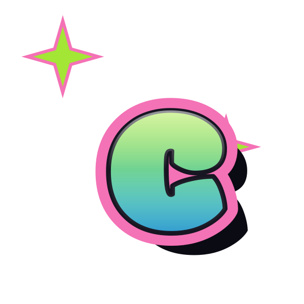
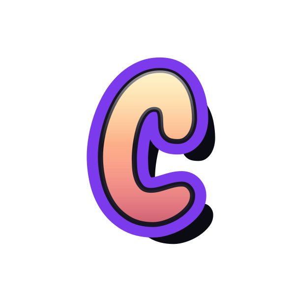
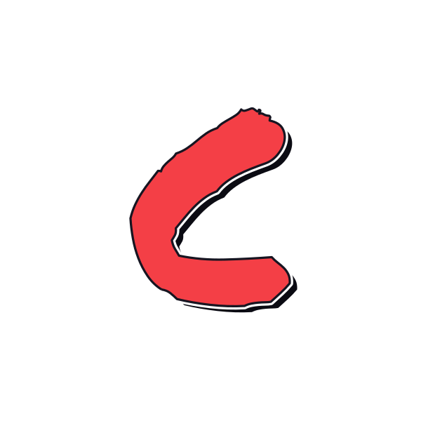
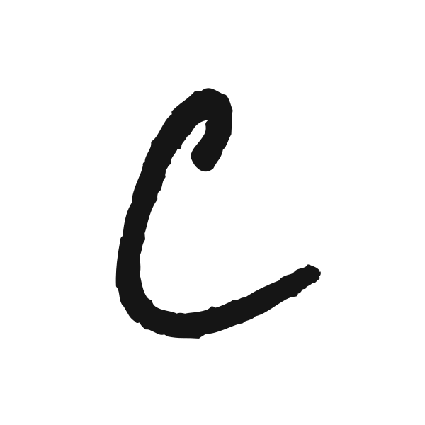
Graffiti letter C depends on a visible opening. These designs range from smooth, rounded arcs to energetic strokes, letting you compare both expression and readability.






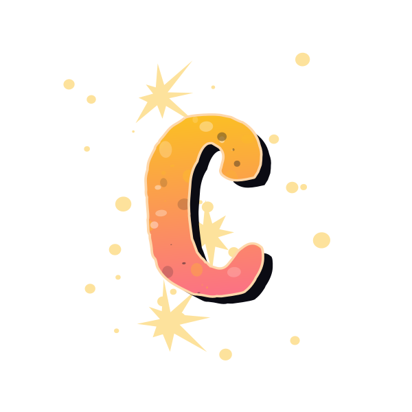

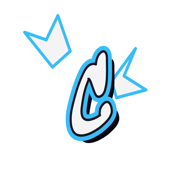




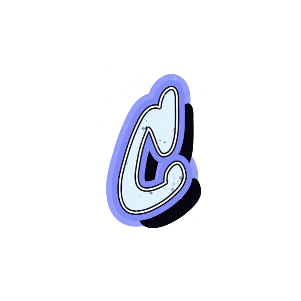
How to use graffiti letter C
- 1
Notice the opening
Pick a C whose right-hand gap remains clear against the preview background.
- 2
Collect the right shape
Save a design that still reads as C when you imagine it smaller.
- 3
Place it on the canvas
Open the selected treatment and leave space around the curve.
- 4
Extend the idea
Add your own text and check that the next letter does not close the opening.
Ideas for your graffiti letter C
Circular portrait
An open C can frame part of an avatar without enclosing it completely.
Podcast cover
A strong curve makes a simple accent beside a short show title.
Corner decoration
Place C near a page corner with its opening facing the content.
Personal label
A clean arc helps identify belongings with a single initial.
Collage lettering
Use a background-free version to layer the curve around other imagery.
Two-letter emblem
Keep the second initial outside the mouth of C for easy reading.
Graffiti letter C FAQs
How do I stop C from looking like O?
Choose a wider opening and avoid placing a busy element directly inside the gap.
Does a thicker C always look bolder?
Thicker strokes add weight, but they also reduce the opening. Compare the silhouette at the intended display size.
Can I use C as a frame?
Yes, as a layout idea. Leave a margin between the curve and the portrait or text it surrounds.
Which style gives C more movement?
Tag treatments often emphasize the start and finish of the stroke, while bubble versions emphasize the rounded body.
How can I reuse the chosen C on a different background?
Download it with transparency and check the outline against the new background before placing it.