Graffiti Letter D
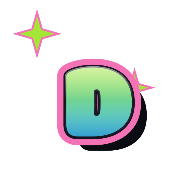
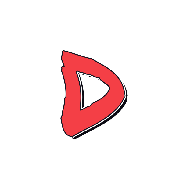
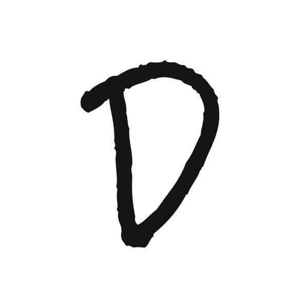
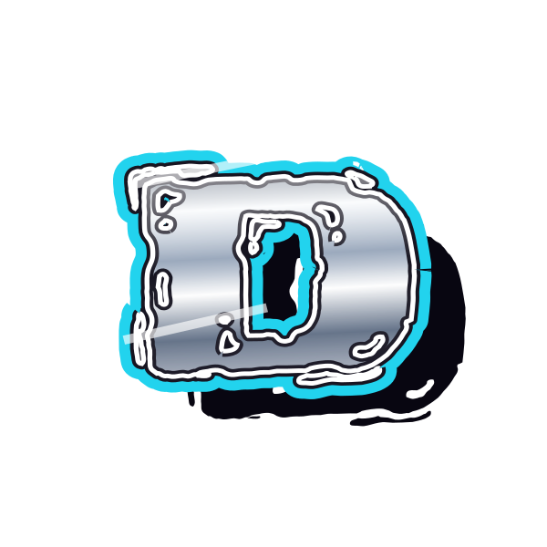
Graffiti letter D pairs a straight edge with a generous curve. Its broad silhouette offers room for texture, highlights and shadow without needing a complicated shape.










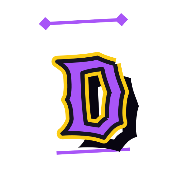
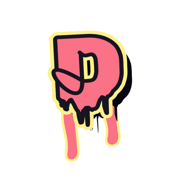

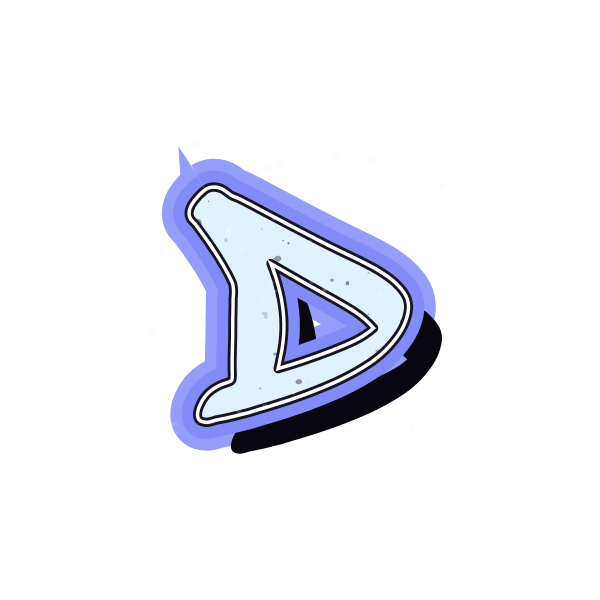
How to use graffiti letter D
- 1
Choose the curve
Compare tall, narrow D forms with wider versions before selecting a design.
- 2
Keep its proportions
Download the favorite that fits the shape of your planned layout.
- 3
Explore the preset
Open D in the editor and adjust the artwork as a whole.
- 4
Fit a word
Replace the initial with text and review the gap after the curved side.
Ideas for your graffiti letter D
Door initial
A large D can serve as a personal room or workspace decoration.
Cover centerpiece
The broad curve creates a substantial single-letter focus on a cover.
Team moodboard
Use D as an initial study when exploring a group identity concept.
Square avatar
Allow extra right-hand room for the curve within a square crop.
Journal divider
A small D can mark a named section in a personal notebook.
Poster name
Let the upright edge introduce a name along a poster margin.
Graffiti letter D FAQs
What makes D easy to recognize?
A visible straight spine and a single large inner space distinguish it from a rounded O.
Is a wide D suitable for a narrow layout?
A tall preset is usually easier to fit. Avoid squeezing the artwork sideways, which changes its proportions.
How should I center D in an avatar?
Judge the visible shape rather than the left edge alone; the curve carries much of the visual weight.
Can I use the shadow on a light background?
Yes, but inspect the contrast after placing it. A shadow that works on the preview may feel different on white.
Can the D preset be applied to more letters?
The editor accepts your own text, so you can carry the selected treatment into a longer word.