Graffiti Letter R
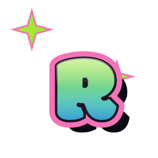
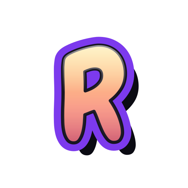
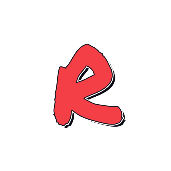
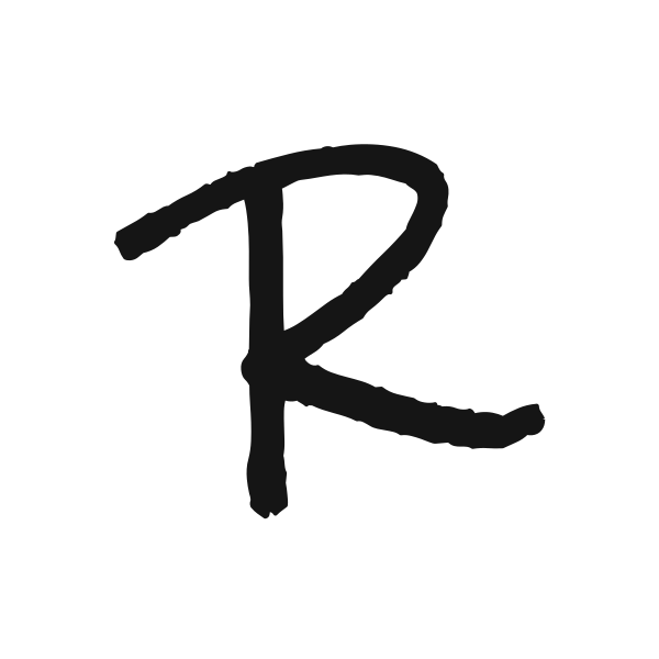
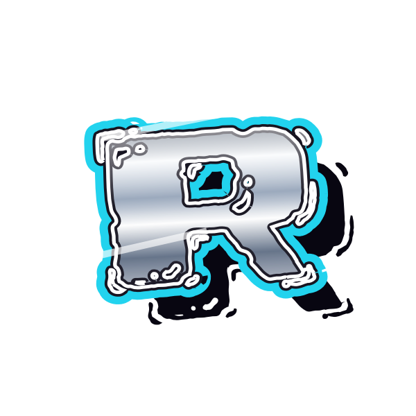
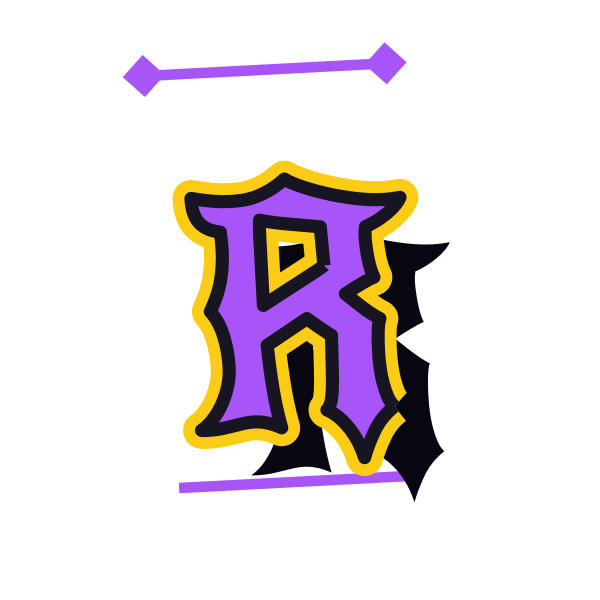
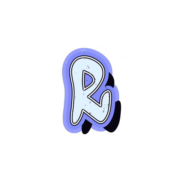
Graffiti letter R combines the upper curve of a bowl with an outward diagonal leg. That mix gives it a different balance from purely rounded or straight-sided capitals.











How to use graffiti letter R
- 1
Compare the leg
Choose an R with a lower stroke that brings the right amount of movement.
- 2
Check the bowl
Save a design whose upper space stays readable beneath its outline.
- 3
Open the selected look
Move R into the editor and give its diagonal room to extend.
- 4
Build a name graphic
Enter the full name and review the space after the kicking leg.
Ideas for your graffiti letter R
Music cover initial
The lower diagonal can add motion to an initial-led cover composition.
Personal signature art
A marker R offers a loose opening for a name treatment.
Room sign concept
Use a clearly separated bowl and leg on a personal decorative print.
Poster corner accent
Let the diagonal face into the page rather than off its edge.
Round-and-sharp pairing
Combine R with an open curve for a varied two-initial layout.
Notebook identity
A compact R creates a recognizable mark on a project cover.
Graffiti letter R FAQs
What distinguishes R from P at small sizes?
The diagonal leg does the work. It needs separation from the stem and enough contrast to remain visible.
Can a rounded R still feel energetic?
Yes. A sweeping lower leg can add movement even when the bowl and corners are soft.
Why does R need extra space near the bottom?
Its leg often reaches beyond the upper bowl, so a tight rectangular crop can make the design feel cramped.
How do I choose between a tag R and a heavier version?
Use the tag for a loose handwritten mood; choose a fuller silhouette when the initial must stand out from farther away.
Can I keep this R style while changing the word?
The editor starts with the selected preset, which you can apply to your own text before saving.