Graffiti Letter J
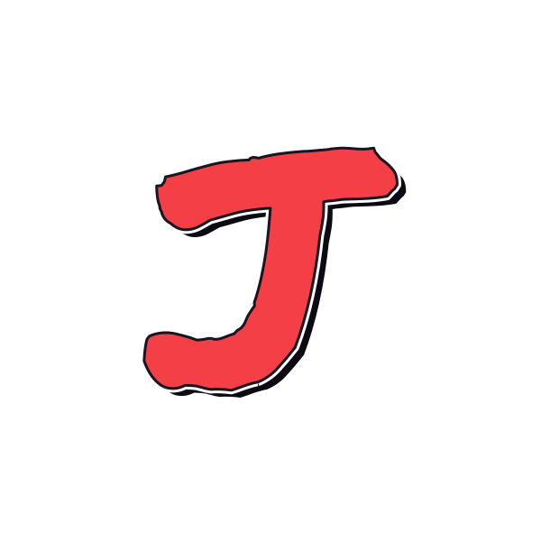
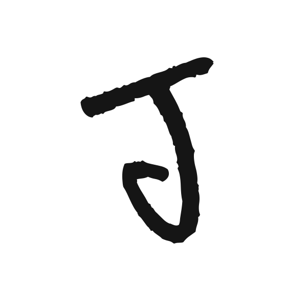
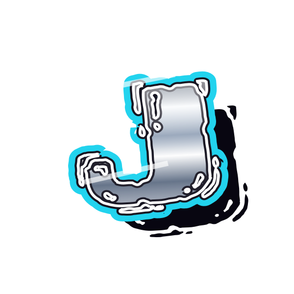
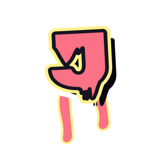
Graffiti letter J turns a long downstroke into a hook. Some treatments emphasize that sweeping finish, while others keep the initial compact and upright.














How to use graffiti letter J
- 1
Follow the hook
Select a J with a lower turn that suits the energy of your design.
- 2
Keep the whole finish
Save the preview with enough breathing room around its bottom curve.
- 3
Find its balance
Open the preset and place J so the hook does not feel crowded.
- 4
Connect a name
Try your own text and inspect the transition from J to the next character.
Ideas for your graffiti letter J
Signature-style initial
A loose J gives a personal name graphic a flowing opening.
Portrait corner
The hook can curve alongside a portrait when kept clear of the face.
Jazz playlist cover
Use a sweeping treatment as an expressive initial accent.
Journal identity
A tall J makes a recognizable mark on a personal diary cover.
Celebration card
A rounded hook adds a friendly touch to an initial-led greeting.
Vertical composition
Let the long stem balance smaller text beside it.
Graffiti letter J FAQs
Why does J seem low in a frame?
Its hook puts visual weight near the bottom. Leave room below it and adjust placement by eye.
Can a J work without a top bar?
Yes. The lower hook is its strongest identifying feature, especially when the downstroke remains clear.
How do I avoid cropping the tail of J?
Keep the full artwork inside your final crop, including shadows or splashes below the hook.
Which J looks most like a signature?
Marker and script-inspired tag treatments usually emphasize the continuous downward motion and exit stroke.
Can I reuse J with different wording?
Open the selected treatment on the canvas and enter new text while keeping the preset as your starting point.