Graffiti Letter T
Graffiti letter T puts its width at the top and its weight down the center. Compare broad crossbars, short caps and marker-like finishes to find the right silhouette.







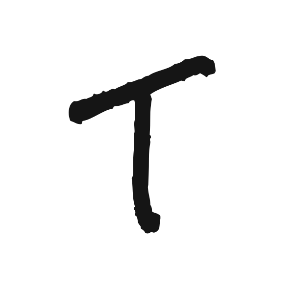





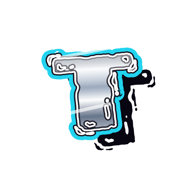

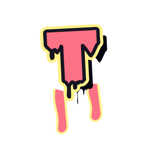

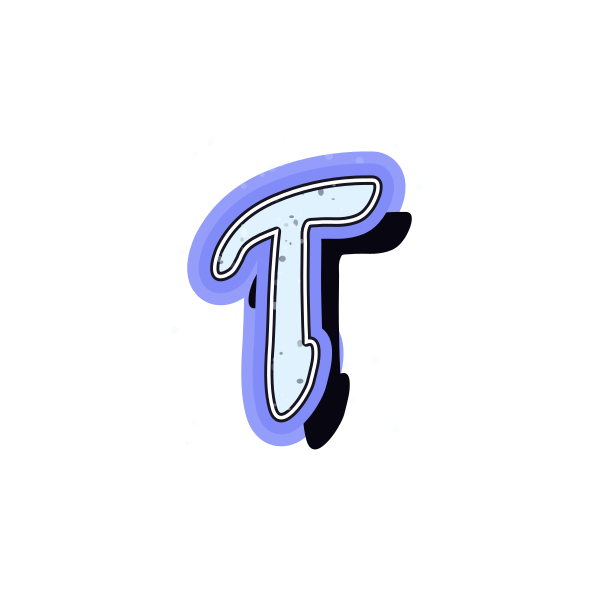
How to use graffiti letter T
- 1
Choose the top span
Pick a T whose crossbar fits the width available in your layout.
- 2
Save the balance
Keep a preview that does not feel too heavy above its stem.
- 3
Position the cap
Open T in the editor and leave space beyond both ends of the top bar.
- 4
Test the next character
Enter your text and look at the gap beneath the overhanging crossbar.
Ideas for your graffiti letter T
Title-page initial
A broad T can introduce a personal booklet or project cover.
Team initial concept
Use a compact version when exploring a shared single-letter mark.
Tall poster composition
The central stem works beside a vertical arrangement of supporting text.
Personal label strip
A narrow-bodied T can fit a small identification graphic.
Travel notebook
Decorate a journal with the initial of a destination or name.
Paired-name artwork
Use the space below the crossbar when balancing two initials.
Graffiti letter T FAQs
Why does T seem wider than its stem suggests?
The top bar defines the outer width. Judge placement by the whole letter, including the overhang.
Can T work in a round profile crop?
Yes, with enough margin at both ends of the crossbar. A shorter top is easier to fit tightly.
What keeps T distinct from a cross symbol?
The top bar and the upright's proportions matter. A clear top-heavy capital shape helps establish it as lettering.
Which T pairs well with curved letters?
A rounded or marker treatment can soften the transition, while an angular T creates a stronger contrast.
How can I adjust spacing beneath the top bar?
Load the complete text in the editor and move individual characters if the default spacing looks uneven.