Graffiti Letter Q
Graffiti letter Q adds a small but important tail to a rounded form. Explore how a short cut, sweeping finish or angular extension changes the character of the loop.

















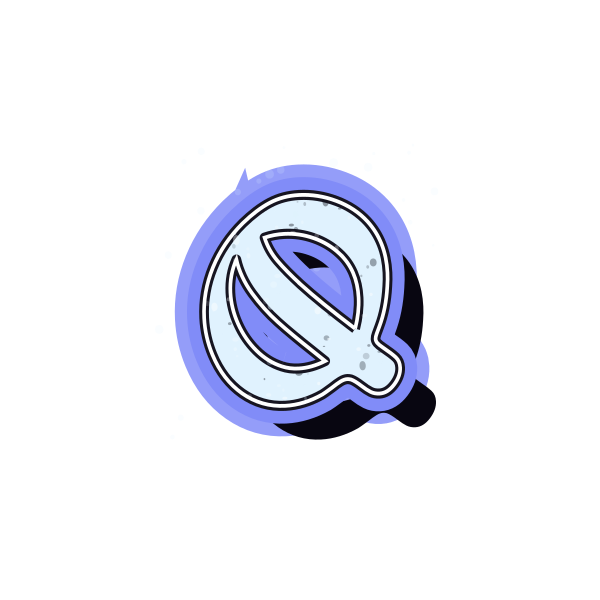
How to use graffiti letter Q
- 1
Find the tail
Choose a Q whose finishing stroke is easy to distinguish from its shadow.
- 2
Save the full outline
Keep a version with enough room around the tail for your final crop.
- 3
Arrange the loop
Open the preset and position the round body before judging the tail's reach.
- 4
Put it in context
Enter your name to see whether the Q remains readable beside other characters.
Ideas for your graffiti letter Q
Distinctive avatar
A visible tail gives a round initial a useful point of difference.
Quiz-night graphic
Use Q as the focal initial on a personal event artwork draft.
Cover detail
Let the tail point toward a small title without touching it.
Personal seal concept
A generous loop can anchor an initial-based badge study.
Journal emblem
Choose a compact finish for a Q placed on a notebook cover.
Initial duo
Pair Q with a straight-sided letter and leave its tail unobstructed.
Graffiti letter Q FAQs
How do I stop Q from looking like O?
Keep the tail visible at the final display size. It should not merge into the background or be cropped away.
Does the tail have to sit outside the loop?
No. Some designs keep part of it inside; what matters is that the finishing stroke remains distinguishable.
Which Q fits a circular crop?
A short-tailed version is easier to contain, while a long tail needs more space around the whole design.
Can I remove a shadow that hides the tail?
Open the preset editor and adjust shadow depth to see whether the finishing stroke becomes clearer.
Is Q suitable as a single initial?
Yes, particularly when the tail is obvious. A supporting name can help if you choose a highly abstract treatment.