
How to Make Bubble Graffiti Letters
Make bubble graffiti letters with the Candy Puff preset. Follow a BUBBLE example, adjust spacing and individual letters, then export a PNG or English SVG.
Bubble graffiti letters use broad, rounded contours that make a word look inflated. To make them in this editor, start with a rounded preset, keep the openings clear, and adjust each letter before exporting. This walkthrough uses BUBBLE in Candy Puff, the same preset shown on the cover.
1. Pick a short word
Open the Candy Puff editor. In the Basic tab, enter BUBBLE under Your text. Leave Style preset on Candy Puff. There are three B letters, so this word lets you compare repeated shapes and adjust each copy independently.
To reproduce the starting artwork, set the canvas to 800 × 450, All letters color to #37d9e8, and Background color to #10131d. In Advanced, turn off Gradient fill and set Letter spacing to 8. Leave the other preset effects unchanged. These settings are an example to inspect, not a formula for every word.
Look first at the enclosed openings inside B and the open space at the top of U. A little overlap can connect the word, but covering those spaces makes the shapes harder to distinguish.
2. Check the bubble graffiti letters as a whole
Compare the top and bottom edges of the word. One letter much larger than its neighbors can dominate the line. Keep a similar height and weight while trying small changes in angle or position.
Check the gaps around the adjacent B letters in the middle. If their outlines merge, select one on the canvas and move it slightly aside. Letter spacing changes the whole word; moving a single letter lets you correct just one pair. Jon Grim’s lettering fundamentals guide explains why proportion and negative space matter before decoration.
3. Choose a small color palette
Keep the cyan fill while judging spacing. If you want a different palette, change All letters color in Basic, or select one letter and use its color control in the Letter tab. Compare the whole word after recoloring; a single bright letter can draw attention away from the rest.
Check the design against its background. A bright outline can separate the letters from a dark background, while a dark outline keeps the word readable on a light background. The editor lets you change the fill, outline, and canvas background while you work.
4. Adjust outlines and shadow depth
A thicker outline changes both the outside edge and the space left inside each letter. In Advanced, adjust Outline width a little at a time. Watch B’s two openings: if they become difficult to see, reduce the width or give the letters more room.
Use Shadow depth to compare a flatter version with a deeper edge. The preset supplies the shadow direction and decorative highlights. You cannot paint a new highlight or move individual highlight marks in this editor. If you are drawing on paper, you can place those accents yourself; the digital controls transform existing letter artwork.
5. Adjust letters one at a time
Select the second B, the third character in BUBBLE, directly on the canvas. Open Letter, set Rotation to −5°, and set Scale to 0.9×. This makes that copy slightly smaller and tilted. Compare its two openings with the neighboring B before deciding whether to keep the change.
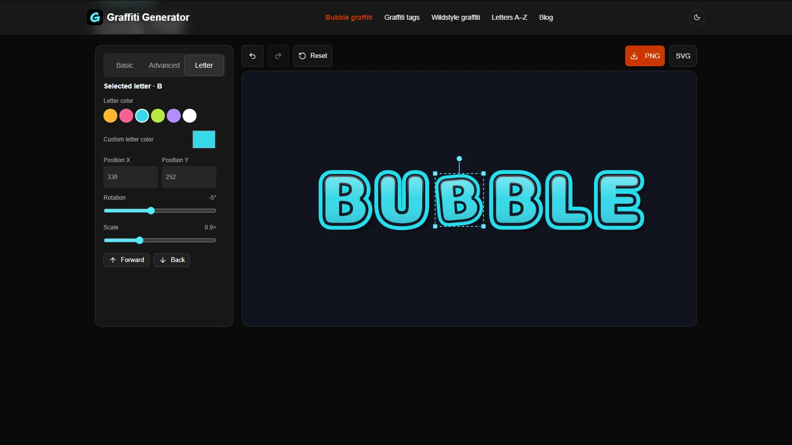
The selected B is one of three independent B letters. Its rotation and scale controls change only that copy.
Drag a letter to reposition it, or use the position fields for a more precise adjustment. Undo lets you compare with the previous state. Before exporting, view the word at the size you expect to use it; small gaps that look clear on the canvas may disappear in a thumbnail.
6. Export the artwork before leaving
The editor does not save or restore your editing session after a reload. Download a result you want to keep before leaving. An exported image is not a project file that restores the letters and controls later.
Choose PNG for a ready-to-use image. To place just the lettering over another background, enable Transparent background in Basic and download PNG. Check the result against the intended background so the outline remains visible.
Choose SVG for a scalable file. The English BUBBLE example exports as letter paths, so those letters do not need an installed font. Do not assume that applies to every supported script: system-font characters may export as text and depend on fonts available when the file is opened.
Frequently asked questions
Can I draw my own bubble letter shapes here?
You can select presets and move, rotate, scale, or recolor their letters. The editor does not offer freehand drawing or editing of individual path points. Sketch a custom outline separately if you need a different letter skeleton.
Why do the B letters look crowded?
Check both the gaps between their outlines and the openings inside them. Try wider spacing first, then reduce outline width or adjust one letter if only a single pair needs room.
Can I continue editing after closing the page?
The current editor does not restore the session. Keep your exported artwork and note the preset and settings if you want to recreate it later.
Try other graffiti styles
Once your bubble graffiti letters read clearly at their intended size, compare them with the Tag tutorial or the three-style comparison. Try the graffiti tag generator, explore angular presets in the wildstyle graffiti generator, or browse individual shapes in the graffiti alphabet A–Z.
Author
Categories
More Posts
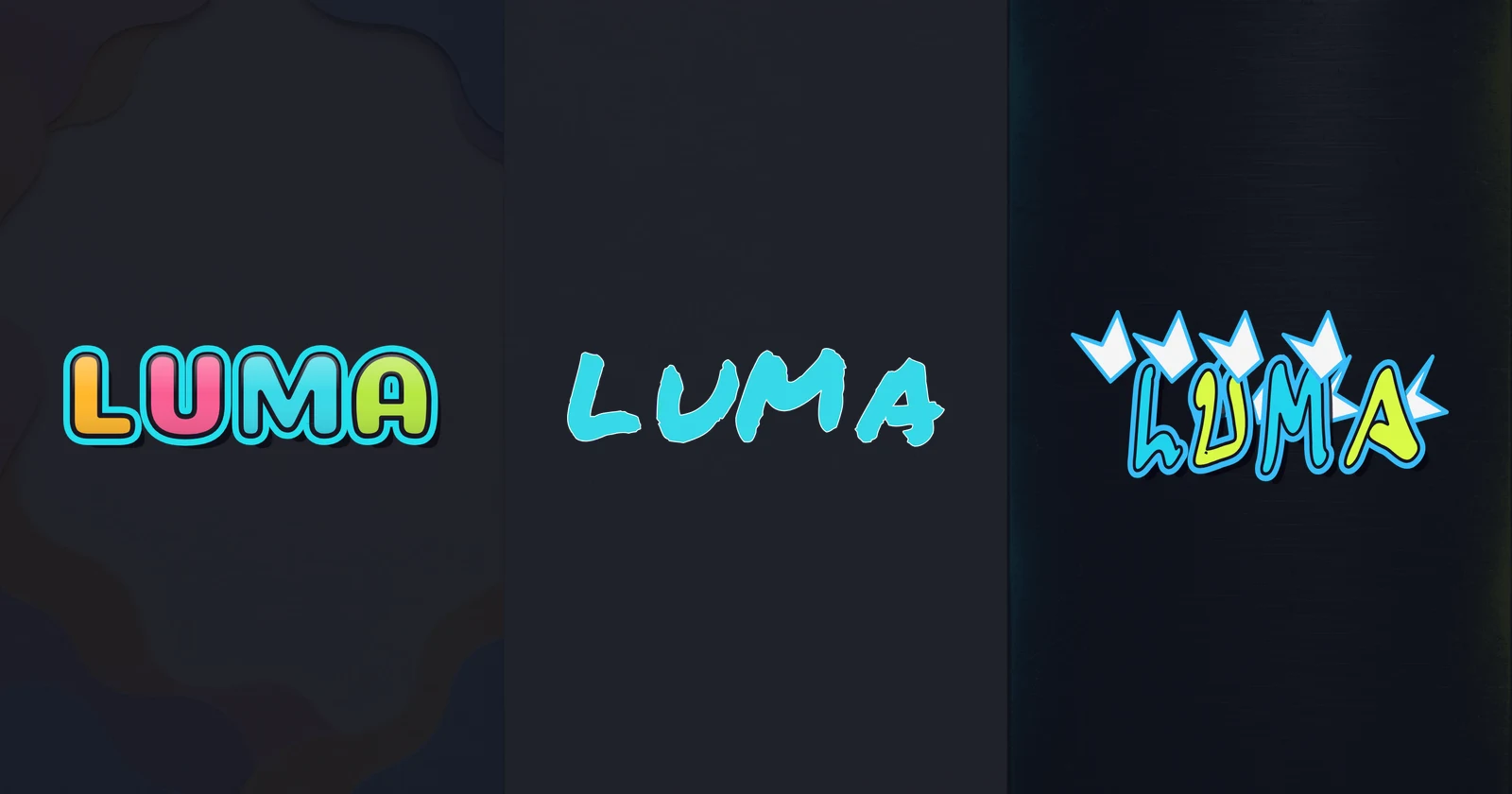
Graffiti Styles Explained: Bubble, Tag, and Wildstyle
Compare graffiti styles: Bubble, Tag, and Wildstyle. See the same word in each style and choose readable lettering for stickers, avatars, and poster titles.
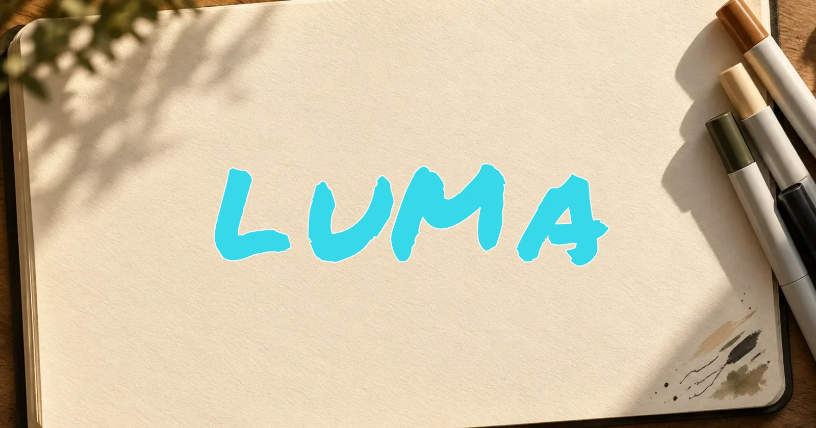
How to Make a Graffiti Tag: A Beginner’s Handstyle Guide
Learn how to make a graffiti tag with clear letters, balanced spacing, and a consistent slant. Practice by hand, then test and export a digital design online.
Newsletter
Join the community
Subscribe to our newsletter for the latest news and updates