How to Make a Graffiti Tag: A Beginner’s Handstyle Guide
Learn how to make a graffiti tag with clear letters, balanced spacing, and a consistent slant. Practice by hand, then test and export a digital design online.
Learning how to make a graffiti tag starts with a word you can write clearly. Choose a short name, give the letters a consistent height, and adjust the spaces between them before adding flourishes. You can explore the same decisions in a digital editor, then return to paper to develop your own strokes.
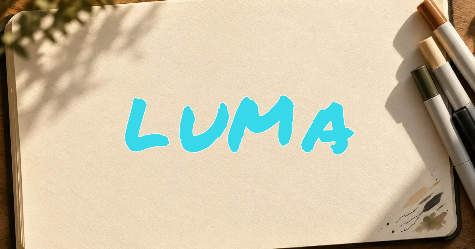
This guide uses LUMA as a practice word. It combines a narrow L, an open U, a wide M, and an angled A, so changes in spacing are easy to spot. It is an example, not a claim that the name is unused.
What is a graffiti tag?
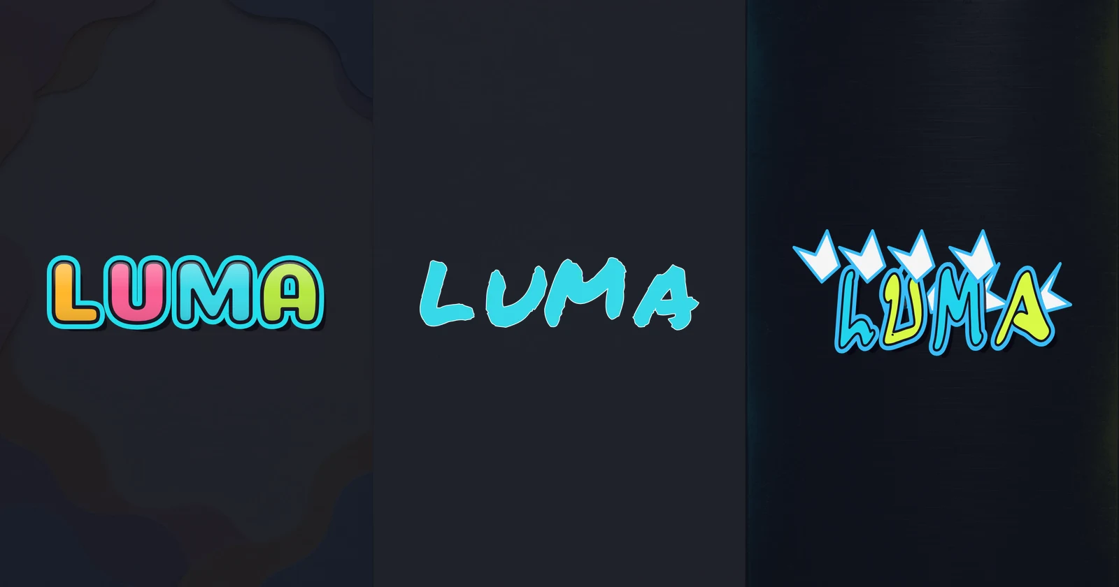
A tag is a writer’s stylized name or signature. Handstyle describes the way that lettering is written: the shapes, stroke rhythm, slant, and relationships between letters. A filled bubble word has a different construction, with an outer contour around each letter.
For graffiti tags for beginners, simple writing gives you something useful to improve. A recognizable L or M makes it easier to judge whether a change helps the word. Extra marks can distract from a weak letter without fixing it.
Jon Grim’s handstyle fundamentals tutorial discusses structure, proportion, and negative space. Those are useful things to examine before experimenting with decoration. Practice on paper or a surface you have permission to use.
How to make a graffiti tag from simple letters
Write LUMA in ordinary capitals with a pencil. Draw a light baseline and a second line for the letter tops. Keep the letters close to those guides while preserving their recognizable parts: the foot of L, the opening of U, the valley in M, and the crossbar of A.
Write a second version with a gentle, shared slant. Compare it with the upright version. If A leans heavily while L stays rigid, the word may feel like separate lettering styles placed together.
Use the graffiti alphabet A–Z to inspect individual silhouettes, but build the word as a whole. An attractive standalone M may be too wide beside your U. At this stage, use one ink color so color changes do not distract you from the structure.
Fix spacing before adding decoration
Negative space includes the gaps between letters and the openings inside them. Both affect whether your graffiti tag letters remain distinct. Equal distances between letter positions do not necessarily look equal, because their edges have different shapes.
In LUMA, the empty area above L’s foot can make the gap before U feel large. Meanwhile, the wide M can crowd A. Look at each neighboring pair rather than applying one spacing rule to every letter.
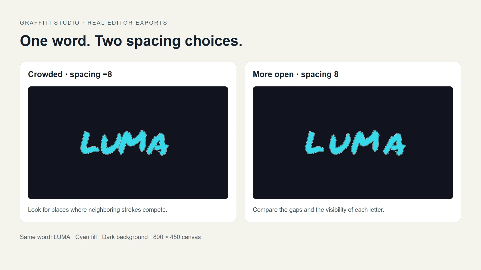
Actual Original Marker exports: spacing −8 on the left, 8 on the right. Both use an 800 × 450 canvas, fill #37d9e8, background #10131d, and Gradient fill off; other preset settings stay unchanged.
The example changes one variable so you can see its effect. A hand-drawn version will need its own adjustments. Compare the gaps, especially around M and A, then judge which layout better preserves the letters. There is no spacing number that works for every word or font.
If the word looks disconnected, bring a pair closer. If two strokes merge, separate them slightly. Check the opening in A after each change. Shrink the result on screen or step back from the paper; awkward joins are often easier to see at a smaller size.
Give the word a consistent graffiti handstyle
Choose one characteristic to repeat: a similar lean, matching curved ends, or a restrained change in height. Keep the plain version nearby so you can compare the experiment against it.
On paper, try rounding U’s base while keeping the M valley clear. If you add a longer ending to A, check whether it pulls attention away from the word. These are drawing exercises; the editor cannot reshape a letter’s individual strokes.
Grim’s tips for styling tags offer examples of small structural changes. Use them as things to investigate, rather than a checklist that every tag must follow.
Set aside a row for repeated practice. Change only one feature in that row, such as slant or spacing. Circle the version you prefer and identify why it works. That gives the next practice session a clearer purpose than simply writing faster.
Test your tag in the online editor
The graffiti tag generator lets you compare preset lettering and adjust the layout. It is useful for digital designs and visual experiments; its font-based letters do not reproduce your individual pen movements.
- Open the Original Marker editor and enter LUMA in Your text.
- Keep Style preset on Original Marker to reproduce the comparison. Set the dimensions and colors above in Basic, then turn off Gradient fill in Advanced.
- Open the Advanced tab and adjust Letter spacing. Start with a modest change and inspect all three gaps.
- Select a letter on the canvas. Drag it to change its position, or use the corner and rotation handles to adjust its size and angle.
- In the Letter tab, adjust that letter’s color, position, rotation, or scale. Use undo if a change makes the layout worse.
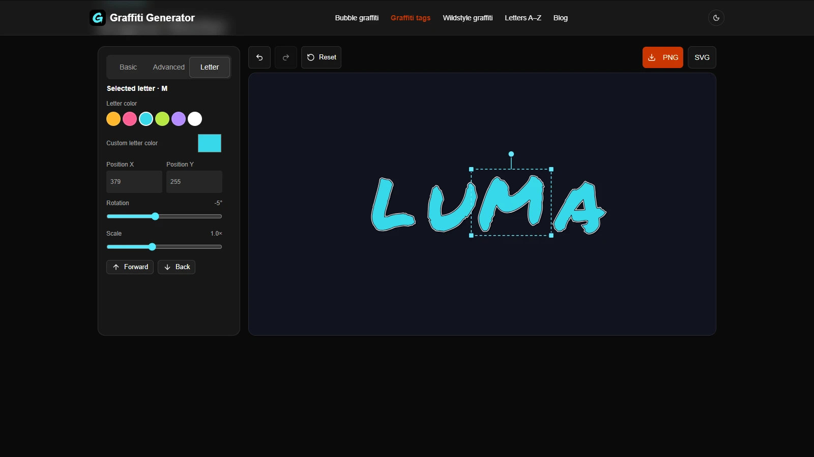
The real editor shows M selected, with its position and rotation controls beside the artwork.
You can move and transform existing letters. The editor does not provide freehand drawing or control over individual points inside a letter. Sketch custom strokes on paper when the change you want involves rebuilding the letter itself.
Download the finished design
For an image with a background, leave Transparent background off and choose PNG. To place the lettering over another image, enable that switch in the Basic tab before downloading PNG. Check the result against both light and dark backgrounds.
Choose SVG when you need a scalable file. The English lettering is exported as paths. Download a result you want to keep before leaving; the editor does not save or restore a project after a reload.
Frequently asked questions
Does a tag have to be one continuous line?
No. The letters can share a rhythm without every stroke connecting. Start with legible shapes and deliberate spacing. Decide where a join helps the word rather than forcing connections everywhere.
Can a generator replace handstyle practice?
It can help you compare layouts and make digital artwork. Handstyle practice develops how you draw the strokes yourself. Use the editor to investigate a visual decision, then test that decision with your own writing.
Why do my letters look mismatched?
Check height, width, slant, and spacing before adding effects. One oversized letter or an unusually wide gap can interrupt the word. Make a small correction, compare it with the previous version, and keep the change only if it helps.
Keep a clear version to compare against
When learning how to make a graffiti tag, keep your simplest version alongside your experiments. It helps you see whether a new angle or flourish improves the word. Next, compare Bubble, Tag, and Wildstyle, or try the bubble lettering tutorial for a different construction.
Author
Categories
More Posts
Graffiti Styles Explained: Bubble, Tag, and Wildstyle
Compare graffiti styles: Bubble, Tag, and Wildstyle. See the same word in each style and choose readable lettering for stickers, avatars, and poster titles.

How to Make Bubble Graffiti Letters
Make bubble graffiti letters with the Candy Puff preset. Follow a BUBBLE example, adjust spacing and individual letters, then export a PNG or English SVG.
Newsletter
Join the community
Subscribe to our newsletter for the latest news and updates